
TL;DR:
- User interface design influences user retention by shaping first impressions, building trust, and reducing friction. Improving load speed, simplifying onboarding, and ensuring visual consistency significantly enhance user loyalty and conversion rates. Continuous testing and data tracking are essential to measure and optimize UI's impact on retention and profitability.
User interface design is the primary visual and interactive layer that shapes whether users return to a digital product after their first session. 88% of users are less likely to return after a poor design experience. That figure alone makes the role of UI in user retention one of the most commercially significant concerns in product design. UI does not operate in isolation. It works alongside user experience (UX) to create the conditions for loyalty, but it carries distinct responsibilities: building trust on first contact, reducing friction at every interaction, and signalling quality through visual consistency.

How does UI shape first impressions and brand trust?
UI is the first thing a user perceives. Before they complete a task or understand a product's value, they have already formed a judgement based on colour, typography, spacing, and layout. That judgement takes milliseconds and it directly influences whether they stay or leave.
UX determines whether users can complete goals, while UI determines how the experience looks and feels during that process. The distinction matters because many product teams conflate the two. Investing in UX flows without attending to UI quality produces products that function well but feel untrustworthy. Users associate visual inconsistency with unreliability, even when the underlying product works perfectly.
UI's contribution to trust operates through several mechanisms:
- Visual hierarchy: Clear, consistent layouts tell users where to look and what to do next, reducing anxiety and building confidence.
- Colour and contrast: Accessible colour choices signal professionalism and inclusivity, both of which reinforce brand credibility.
- Typography: Legible, well-spaced type reduces cognitive effort and keeps users engaged longer.
- Micro-interactions: Subtle animations and feedback states confirm that actions have registered, which builds a sense of reliability.
Pro Tip: Run a five-second test with new users before launch. Show them a single screen for five seconds, then ask what they remember and whether they trust the product. The answers reveal whether your UI is communicating the right signals before any interaction occurs.
UI's role in UI design and user loyalty is therefore foundational. A product that looks credible earns the benefit of the doubt when something goes wrong. A product that looks inconsistent or cluttered loses users before they have experienced its core value.
What UI design factors drive retention and reduce churn?
Retention is not purely a visual problem. Friction in usability and interaction speed are the primary churn drivers, not visual polish alone. That said, specific UI factors have a direct and measurable impact on whether users return.
Performance speed
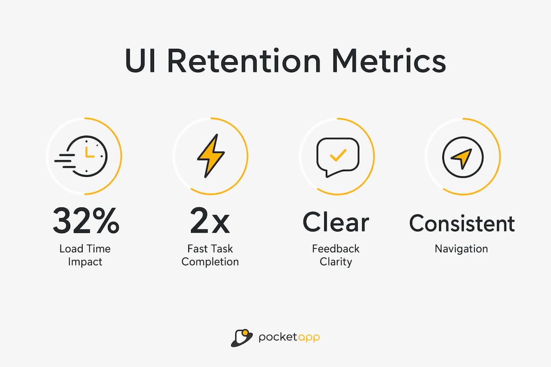
Each additional second of load time increases bounce probability by 32%. Speed is a UI concern because perceived performance is shaped by loading states, skeleton screens, and progress indicators. A well-designed loading state keeps users engaged during delays. A blank screen loses them.
Task completion speed
Users who complete their first core task in under five minutes retain at twice the rate of those who take over 15 minutes. UI directly controls this through layout clarity, button placement, and the elimination of unnecessary steps. Every additional tap or scroll is a retention risk.
Feedback clarity
Users need to know that their actions have worked. Unclear error messages, absent confirmation states, and ambiguous button labels all create micro-friction. Auditing micro-friction points such as unclear labels and load delays is one of the highest-return activities in retention design.
The table below maps the key UI factors to their retention impact and the design response each requires.
| UI factor | Retention impact | Design response |
|---|---|---|
| Load time | 32% higher bounce per extra second | Skeleton screens, optimised assets |
| Task completion speed | 2x retention for sub-5-minute first tasks | Simplified flows, clear CTAs |
| Feedback clarity | Micro-friction causes more churn than missing features | Explicit confirmation states, clear error copy |
| Visual consistency | Inconsistency signals unreliability | Design system with shared components |
| Navigation structure | Hidden navigation increases drop-off | Persistent, labelled navigation patterns |
Pro Tip: Audit your product for micro-friction before your next feature release. Map every step a new user takes in their first session and count the number of moments where they must pause, re-read, or guess. Each one is a churn risk that costs more to recover from than to fix upfront.
Best practices for UI design that improve user loyalty
The most effective UI strategies for retention share a common principle: reduce the distance between a user's arrival and the moment they experience value.
-
Simplify onboarding interfaces. Onboarding redesigns that reduce form fields and apply smart defaults can improve initial retention rates by 40%. Removing unnecessary choices from an onboarding flow is not a cosmetic decision. It is a retention decision. Reducing options from 12 to 4 in a single onboarding screen has been shown to boost trial-to-paid conversion by 31%.
-
Apply personalisation through adaptive UI patterns. Personalisation via UI makes products feel tailored to individuals, increasing perceived relevance and reducing cognitive load. This does not require complex machine learning. Remembering a user's last action, pre-filling known fields, and surfacing relevant content based on prior behaviour all count as personalisation at the UI layer.
-
Eliminate visual clutter. Cognitive load is the enemy of retention. Every element on screen that does not serve the user's current goal competes for attention and slows task completion. Apply progressive disclosure: show only what is needed at each stage and reveal complexity as users advance.
-
Establish a consistent design system. Consistency reduces the learning curve across sessions. When buttons, icons, and navigation patterns behave the same way throughout a product, users build muscle memory. That familiarity is a retention asset. Repeated positive interactions lower cognitive load and build the emotional connection that sustains loyalty over time.
-
Run iterative usability testing. UI improvements compound. Continuous UX improvements can yield retention gains of up to 10.8% over three years. That figure reflects the cumulative effect of small, regular fixes rather than infrequent large redesigns. Schedule monthly usability sessions with real users and treat every friction point surfaced as a retention opportunity.
How do you measure the impact of UI on retention?
Measuring how UI influences retention requires tracking the right metrics at the right points in the user journey. The goal is to connect specific UI changes to observable shifts in user behaviour.
The most direct metrics are load time, task completion rate, bounce rate, and session depth. Load time is the bluntest instrument: if it rises, bounce rate follows. Task completion rate reveals whether UI flows are clear enough for users to achieve their goals without assistance. Bounce rate at specific screens identifies where UI is failing to hold attention.
Beyond quantitative metrics, qualitative methods add essential context. Session recording tools capture where users hesitate, misclick, or abandon flows. Heatmaps show which UI elements attract attention and which are ignored. Moderated usability testing surfaces the reasoning behind behaviour, which numbers alone cannot explain.
The most productive approach combines both. A spike in bounce rate on a specific screen is a signal. A session recording of that screen explains the cause. A usability test confirms whether a proposed fix resolves it. This cycle, applied consistently, is how UI teams improve app UX step by step and build measurable retention gains over time.
Pro Tip: Set a retention baseline before any UI change goes live. Measure day-1, day-7, and day-30 retention for a cohort using the existing design. Then measure the same intervals for the cohort that experiences the new design. Without a baseline, you cannot attribute retention changes to UI decisions with any confidence.
A structured approach to UX/UI improvement treats retention metrics not as report-card figures but as diagnostic signals. Each metric points to a specific layer of the product where UI is either supporting or undermining the user's path to value.
Key takeaways
UI design is the most direct lever product teams control for shaping first impressions, reducing friction, and building the trust that brings users back.
| Point | Details |
|---|---|
| UI builds trust before UX can act | Users form visual judgements in milliseconds; poor UI loses them before they experience product value. |
| Speed is a retention variable | Each extra second of load time raises bounce probability by 32%; optimise loading states as a priority. |
| Onboarding UI has outsized impact | Simplifying onboarding flows can improve initial retention by 40% and boost conversion by 31%. |
| Micro-friction causes more churn than missing features | Audit unclear labels, hidden navigation, and slow responses before adding new functionality. |
| Continuous improvement compounds | Regular, incremental UI fixes can deliver retention gains of up to 10.8% over three years. |
UI and UX are not rivals: a perspective worth holding
The debate about whether UI or UX matters more for retention is a distraction. I have seen product teams spend months arguing about it while their onboarding screens haemorrhage users at step two. The honest answer is that they are interdependent, but they fail in different ways and at different moments.
UX failures tend to be invisible. Users do not always know why a product felt confusing. They just leave. UI failures are more visible but often dismissed as cosmetic. That dismissal is a mistake. A product with excellent flows but inconsistent, cluttered, or slow UI will still lose users. Visual trust is not decoration. It is the signal that tells a user whether to invest their time in learning your product.
The teams I have seen retain users most effectively treat UI as a functional discipline, not an aesthetic one. They measure it, test it, and fix it with the same rigour they apply to backend performance. They understand that the business case for UX investment is inseparable from the case for UI investment. A 5% improvement in retention can increase profits by 25–95%. That is not a UX statistic or a UI statistic. It is a product quality statistic, and both disciplines own it.
My advice: stop treating UI polish as the reward you give yourself after the hard UX work is done. Treat it as a parallel workstream with its own metrics, its own testing cadence, and its own direct line to retention outcomes.
— Paul
How Pocketapp approaches UI design for retention
Pocketapp has delivered over 300 mobile app projects for clients including WWF, Dechra, and Crocus, with mobile app development that places UI quality and retention outcomes at the centre of every build.
The Pocketapp process combines iterative UI design with structured usability testing, ensuring that onboarding flows, navigation patterns, and interaction states are validated against real user behaviour before launch. For product teams that need to move from first build to measurable retention improvement, Pocketapp's app design services offer the expertise to close the gap between a functional product and one that users genuinely return to. Get in touch to discuss how UI design can become a measurable retention asset for your product.
FAQ
What is the role of UI in user retention?
UI shapes the visual trust and interaction clarity that determine whether users return after their first session. It supports retention by reducing friction, building brand confidence, and helping users reach value quickly.
How does UI differ from UX in driving retention?
UX determines whether users can complete their goals; UI determines how the product looks and feels during that process. Both contribute to retention, but they fail in different ways and require separate measurement.
Which UI elements have the biggest impact on retention?
Load time, onboarding simplicity, feedback clarity, and navigation consistency have the most direct impact. Each additional second of load time raises bounce probability by 32%, making performance a critical UI concern.
How can I measure UI's effect on retention?
Track load time, task completion rate, bounce rate, and session depth. Combine quantitative metrics with session recordings and usability testing to identify the specific UI changes that shift retention outcomes.
Does improving UI really increase profits?
A 5% improvement in retention can increase company profits by 25–95%. Because UI directly influences whether users return, investment in UI quality has a clear and measurable commercial return.