
TL;DR:
- UI animation in apps is a critical, functional tool that enhances user feedback, navigation, and trust. Proper timing, easing, and early integration into design systems ensure consistency, accessibility, and performance across platforms. Over-animated interfaces can slow performance and cause user discomfort; therefore, purposeful motion should be prioritized from the project’s inception.
UI animation in apps is widely misread as a visual flourish. It is not. Purposeful motion is one of the most functional tools in your design system, and the numbers back this up. Functional animations can increase user engagement by up to 40% and reduce bounce rates by 22%. For app designers, developers, and product managers, that gap between decorative and purposeful animation is where real product quality is built. This guide cuts through the surface-level thinking and gives you a precise, practical understanding of what UI animation actually is, how it works, and how to use it well.
Table of Contents
- Key takeaways
- What UI animation in apps really means
- UI animation techniques that actually work
- Accessibility and performance in UI animation
- UI animation best practices with real examples
- My honest take on where teams go wrong
- Build animation into your app from day one
- FAQ
Key takeaways
| Point | Details |
|---|---|
| Animation is functional, not decorative | Purposeful motion communicates feedback, state changes, and hierarchy to users clearly. |
| Timing is everything | Micro-interactions should run 80–150ms; transitions 300–400ms to feel natural, not sluggish. |
| Build motion into design systems early | Animation added as final polish creates inconsistency and technical debt across platforms. |
| Accessibility is non-negotiable | Respecting "prefers-reduced-motion` requires alternative design, not simply disabling all animation. |
| Over-animation harms performance | The 3-second rule keeps total animation per screen under a threshold that causes fatigue. |
What UI animation in apps really means
UI animation in apps refers to any motion applied to interface elements that serves a defined purpose within the user experience. That purpose might be confirming an action, guiding attention, communicating progress, or conveying spatial relationships between screens. What it is not, at least in any mature design system, is motion applied because it looks impressive.
There are four functional categories worth distinguishing clearly.
- Navigational and spatial transitions show users where they are going and where they have come from. A card expanding into a detail view, or a screen sliding in from the right, tells the user the relationship between those two states without a word of copy.
- Feedback and status animations confirm that something happened. A button that physically depresses on tap, a form field that shakes when an entry is invalid, a toggle that animates between states. These are micro-interactions that confirm user actions, guide attention, and add personality without overwhelming the interface.
- Loading and wait-state animations manage expectation during latency. A skeleton screen or progress indicator does not make content load faster, but it makes the wait feel shorter and communicates that the app is working rather than frozen.
- Emotional and brand animations are the only category that leans aesthetic, but even here, the best examples serve a purpose. An onboarding animation that establishes tone and brand personality is doing real work for user trust and retention.
The distinction between functional and decorative animation is not always obvious, but a reliable test is this: if you removed the animation, would the user lose information or confidence? If yes, it is functional. If the answer is no, you are likely decorating.
Motion is also, in a neurological sense, a bridge for physical feedback in touch interfaces. Physical buttons give tactile confirmation. Digital interfaces do not. Animation is the closest approximation we have, which is why its absence in key moments erodes trust in an app without users being able to articulate why.
UI animation techniques that actually work
Getting animation right is primarily a question of discipline. The tools matter less than the judgement you apply to timing, easing, and where motion appears in your workflow.
Timing and duration
Standard animation durations are 80–150ms for micro-interactions and 300–400ms for full screen transitions. Anything beyond 500ms begins to feel sluggish, and users will register the wait even if they cannot name why the app feels heavy. Short interactions should be quick and precise. Longer transitions can afford a little more grace, but not at the expense of momentum.
Easing curves
Linear easing is the default in many tools and the wrong choice for almost every situation. Ease-in and ease-out curves mimic natural physical motion, where objects accelerate and decelerate rather than maintain constant speed. An element entering the screen should ease out, slowing as it arrives. An element leaving should ease in, accelerating as it exits. This matches the physical intuition users bring from the real world and makes motion feel grounded rather than mechanical.
Integrating animation into your design system
One of the most costly mistakes teams make is treating animation as the final layer of polish, added in the last sprint before launch. Integrating animation early into your design system prevents inconsistency and improves functional reliability across the product. When motion is defined at the component level, every instance of a button, modal, or navigation element behaves predictably.
Shared motion tokens across design and development teams prevent animation bloat and improve product coherence. A motion token might define a standard duration, a named easing curve, or a specific transform property. When designers and developers reference the same token, the product moves as one system rather than a collection of individually animated parts.
Pro Tip: Create a motion audit before your next sprint. List every animated element in your app and ask whether it has a defined functional purpose. Anything that fails that test is a candidate for removal, not refinement.
Common mistakes to avoid:
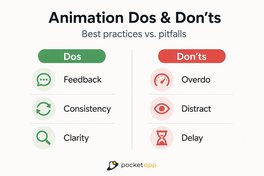
- Using linear easing across the board
- Animating elements that do not require user attention
- Adding motion at the end of the development cycle as an afterthought
- Using different durations and curves for the same component type in different parts of the app
Accessibility and performance in UI animation
Animation is where good intentions and poor execution collide most visibly. For some users, motion is not just an aesthetic preference. It is a health consideration.

The prefers-reduced-motion setting
A significant portion of users enable prefers-reduced-motion in their operating system settings because of vestibular disorders, photosensitivity, or cognitive conditions exacerbated by rapid movement on screen. The critical misunderstanding here is that respecting this preference does not mean switching all animation off. Responding to reduced motion means providing a different design with non-spatial transitions rather than simply turning off animations. A fade or a cross-dissolve replaces a slide or a scale transform, preserving the informational function of the animation without the spatial movement that causes discomfort.
| Approach | Standard motion | Reduced motion alternative |
|---|---|---|
| Screen transition | Slide in from right | Fade or cross-dissolve |
| Modal entrance | Scale up from centre | Opacity fade in |
| Element highlight | Bounce or pulse | Colour shift or border change |
| Loading indicator | Spinning animation | Static progress bar or text update |
Avoiding over-animation
Over-animating makes an interface feel slower and more distracting rather than polished and engaging. The 3-second rule offers a practical ceiling: total animation time per screen or task should not exceed three seconds. If you are stacking entrance animations, micro-interactions, and transitions in sequence, you are almost certainly past that threshold on a busy screen.
Performance cost is also real. Complex animations driven by CSS or JavaScript that trigger layout recalculations degrade frame rates and battery life, particularly on mid-range Android devices. If you are running your animations on the GPU through transform and opacity properties, rather than properties that trigger layout reflows, you will see significantly better performance. Treat animation like any other performance budget item.
Pro Tip: Test your animations on a mid-range Android device, not just the latest flagship. If the motion feels choppy or causes janky scrolling, it will affect a large portion of your real user base.
UI animation best practices with real examples
Knowing the principles is useful. Seeing them applied to recognisable UI patterns is more useful still.
Micro-interactions for feedback
A like button that triggers a small burst of particles or colour when tapped gives immediate emotional confirmation. A password field that shakes horizontally when an incorrect entry is made communicates failure without a modal or an error message that interrupts the flow. These are design details that improve UX without adding cognitive load.
Loading animations that communicate honestly
The worst loading animation is a spinner with no context. A progress bar is better because it implies measurable progress. A skeleton screen is better still because it sets spatial expectations for where content will appear, reducing the perception of wait time. The key principle is that the animation should represent what is actually happening, not simply fill silence.
Navigation animations that orient users
When a user taps into a sub-section of an app and presses back, the return animation should reverse the entry animation. This spatial consistency builds a mental map of the app structure. If every transition moves in the same direction regardless of whether the user is going deeper or returning, that mental map collapses and the app feels disorienting.
You can find more detail on how animation fits into broader UX strategy in this step-by-step UX guide on improving app retention.
Tools for production-level animation
The tools you use matter when animation needs to be maintainable, performant, and consistent across platforms.
- Rive handles complex interactions using state machines that manage motion across platforms consistently. It separates animation logic from code, which improves maintainability significantly.
- Lottie renders After Effects animations as JSON on mobile, making it practical for brand and illustrative animations without heavy performance overhead.
- React Native Reanimated provides thread-safe animation for React Native apps, keeping motion off the JavaScript thread and on the UI thread where it belongs.
Choosing between these depends on complexity. Micro-interactions and state-driven UI motion suit Rive. Illustrative or brand animations suit Lottie. Native app motion in React Native suits Reanimated. You do not need all three, but knowing when each applies will save you significant refactoring work later.
My honest take on where teams go wrong
In my experience, the biggest failure mode in UI animation is not poor taste. It is timing. Not animation timing, though that matters too. Organisational timing. Animation gets handed off to a developer in the final two weeks of a project with a brief like "make it feel polished," and the result is a set of transitions that look fine individually and feel incoherent together.
I have seen products where every screen has a different entrance animation, different durations, and different easing curves because no one defined a motion system early enough for anyone to follow. The app looks busy and feels slow, even when the underlying performance is fine.
What I have found actually works is treating animation as a first-class component of the design system, the same way you would treat typography or colour. Define it early, token it up, and give developers something concrete to reference. The discipline required is exactly the same as any other design decision. The only thing that changes is the property being defined.
I am also cautious about emotional and brand animation. It is the area where teams are most likely to over-invest and least likely to ask whether the motion earns its place. If you can answer the question "what would the user not understand or feel without this animation?" with something specific, keep it. If the answer is vague, cut it.
You can see current animation trends in app design if you want context on where the industry is heading, but the fundamentals above will outlast any trend.
— Paul
Build animation into your app from day one
At Pocketapp, we have built and designed over 300 mobile applications, and the projects where animation works best are always the ones where it was part of the conversation from the discovery phase. Motion language gets defined alongside colour systems and component libraries, not after them. If you want your app to feel genuinely considered rather than visually cluttered, that sequence matters enormously.
Whether you are starting a new product or improving an existing one, our team integrates motion design into the design system from the outset. Explore our app design services or take a closer look at our mobile app development work to see how we approach animation as a functional UX tool. Get in touch and we will show you what purposeful motion looks like in practice.
FAQ
What is UI animation in apps?
UI animation in apps refers to motion applied to interface elements to serve a functional purpose, such as communicating feedback, showing state changes, guiding attention, or establishing spatial relationships between screens. Unlike decorative motion, functional animation improves clarity and user confidence.
How long should UI animations be?
Micro-interactions should run between 80 and 150 milliseconds, while screen transitions typically work best between 300 and 400 milliseconds. Anything above 500 milliseconds begins to feel sluggish and can make an otherwise performant app feel slow.
What are the main benefits of UI animation?
Purposeful UI animations increase user engagement, reduce bounce rates, and communicate app behaviour more clearly than static interfaces. Research shows well-implemented motion can lift engagement by 40% compared to fully static experiences.
How should I handle animation for users with motion sensitivity?
Enable alternative non-spatial transitions for users with prefers-reduced-motion active. Replace slides and scale transforms with fades or cross-dissolves. This preserves the functional information of the animation without the spatial movement that causes discomfort for some users.
What tools are best for UI animation in mobile apps?
Rive suits complex, state-driven UI animation and works well across platforms. Lottie is the standard for brand and illustrative animations. React Native Reanimated is the preferred choice for thread-safe animation in React Native applications.