
25% of users abandon apps after a single use, and poor UX is almost always the culprit. For product managers and UX designers, that statistic is not just alarming — it is a direct challenge to every design decision your team makes. The good news is that retention is not a mystery. It is the measurable result of deliberate, research-backed UX choices made at every stage of the product lifecycle. This guide walks you through a practical, step-by-step framework — from foundational research to continuous experimentation — so you can identify where your app is losing users and fix it with confidence.
Table of Contents
- Laying the groundwork: research and analysis
- Designing for simplicity, clarity and accessibility
- Tackling edge cases and real-world interruptions
- Effective onboarding: fast time-to-value and retention
- Continuous improvement: analytics, experimentation and feedback
- Partnering to build exceptional app experiences
- Frequently asked questions
Key Takeaways
| Point | Details |
|---|---|
| Start with user research | Understanding real user needs is essential before making any design changes. |
| Simplify and clarify | Simple, intuitive interfaces improve user retention and reduce abandonment. |
| Design for real-world use | Catering for edge cases and interruptions ensures reliability and trust. |
| Onboard quickly for retention | Faster value delivery during onboarding dramatically increases the chance users stay. |
| Iterate and measure | Continual analytics and feedback cycles ensure your UX stays effective over time. |
Laying the groundwork: research and analysis
Before you redesign a single screen, you need to understand why users are leaving. Skipping this step is the most common and costly mistake product teams make. Assumptions about user behaviour are almost always wrong, and redesigning based on gut feel tends to create new problems rather than solve existing ones.
Effective UX improvement starts with usability testing, diary studies, and remote interviews — each method revealing a different layer of user behaviour. Usability testing shows you where people get stuck in real time. Diary studies capture how users interact with your app across days or weeks, surfacing patterns that a single session would miss. Remote interviews give you the emotional context behind the data.
Choosing the right method depends on your app's stage and your team's capacity. Early-stage products benefit most from interviews and observational testing. More mature apps with existing traffic can leverage mobile research methods like A/B testing and in-app surveys to validate specific hypotheses at scale.
Once you have gathered insights, the next step is turning them into testable hypotheses. For example: "Users are dropping off at the payment screen because the form has too many required fields." That is a specific, actionable statement you can test and measure.
"The best UX decisions are not made in the design tool — they are made in the research session."
Building using feedback loops into your regular workflow ensures insights keep flowing, not just at project kick-off. The role of user feedback in development is often underestimated, but teams that embed it consistently make faster, more confident decisions.
Key research methods to consider:
- Moderated usability testing (in-person or remote)
- Unmoderated task-based testing
- Diary studies for longitudinal behaviour
- Remote interviews for qualitative depth
- A/B testing for quantitative validation
Pro Tip: Run quick, five-participant usability studies at the end of each sprint. You will catch the majority of critical UX issues before they reach production.
Designing for simplicity, clarity and accessibility
With user insights in hand, the next step is to craft app interfaces that put clarity and ease-of-use centre stage. Cluttered screens and confusing navigation are not just aesthetic problems — they directly reduce task completion rates and push users towards competitors.
Prioritise simplicity, intuitive navigation, and reduce cognitive load by applying four core principles in your UI: structure, transparency, clarity, and support. Structure means organising content so users always know where they are. Transparency means the app communicates what it is doing. Clarity means every label, button, and message is unambiguous. Support means the interface helps users recover from mistakes without frustration.

Accessibility is not optional. Touch targets should be at least 44x44 points, font sizes should exceed 11pt, and colour contrast ratios must meet WCAG AA standards. These are not edge-case concerns — they affect a significant portion of your user base and directly impact the ROI of great UX.
When it comes to visual consistency, the choice between following Material Design guidelines and building a custom design system is a genuine strategic decision. Here is how the two approaches compare:
| Factor | Material Design | Custom design |
|---|---|---|
| Familiarity | High — users recognise patterns | Lower — requires learning curve |
| Brand expression | Limited | Full control |
| Development speed | Faster with component libraries | Slower initial build |
| Accessibility | Built-in guidance | Must be designed in |
| Consistency | Enforced by the system | Requires discipline to maintain |
For most teams, a hybrid approach works best: use platform conventions for navigation and interaction patterns, then layer your branding in UX on top through colour, typography, and tone of voice.
You can also reduce cognitive load by breaking long forms into progressive steps, using single-column layouts on mobile, and removing any element that does not serve a clear purpose.
Simplicity checklist for your next UI review:
- Remove any screen element that users did not notice in testing
- Ensure every CTA label describes the outcome, not the action
- Limit primary actions per screen to one
- Use progressive disclosure to hide advanced options until needed
Pro Tip: Conduct a "five-second test" on your key screens. If users cannot identify the primary action within five seconds, simplify immediately.
Tackling edge cases and real-world interruptions
Even beautifully designed screens fall short if you ignore what happens outside the happy path. Most real app journeys involve interruptions, errors, and non-standard behaviours — and designing only for the ideal scenario means you are designing for a minority of actual sessions.
Edge cases often represent the majority of interactions for real users. A phone call mid-checkout, a lost network connection during a form submission, a shared device where session state is unclear — these are not rare. They are Tuesday.
"Edge cases are the main journey for most users."
The most impactful fixes are often the simplest. Auto-saving progress prevents users from losing work when they are interrupted. Clear, human-readable error messages tell users what went wrong and what to do next. Retry options with a single tap remove the friction of starting over. Designing user flow in design to account for these moments is what separates good apps from great ones.
For more detailed guidance on edge case design, the Nielsen Norman Group provides a solid framework for identifying and prioritising non-standard scenarios.
Must-test scenarios for your QA process:
- No network connection or intermittent connectivity
- Session timeout mid-task
- Accidental back navigation during a multi-step flow
- Incomplete or partially submitted forms
- App backgrounded and resumed mid-journey
- Low storage or battery warnings during critical actions
Building these scenarios into your QA checklist is not extra work — it is the work. Teams that skip this step consistently see higher uninstall rates and negative reviews citing "bugs" that are actually unhandled edge cases.
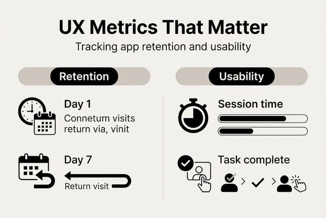
Effective onboarding: fast time-to-value and retention
Having covered how to support users through confusion and errors, let us ensure their first experience is seamless and memorable. Onboarding is the single highest-leverage moment in your app's lifecycle. Get it right and you dramatically shift your retention curve.
Smooth onboarding increases retention by 50%, while poor UX can drop retention by 40%. The numbers make the case clearly. Here is how retention typically looks across the first month, and what good UX can achieve:
| Metric | Industry average | With optimised UX |
|---|---|---|
| Day 1 retention | 23 to 25% | Up to 40% |
| Day 7 retention | 11% | Up to 20% |
| Day 30 retention | 5% | Up to 12% |
The goal of onboarding is not to explain every feature. It is to get users to their first moment of value as fast as possible. Every extra step between download and that moment costs you users.
Step-by-step onboarding improvements:
- Remove forced account creation before users experience core value
- Use progressive disclosure to introduce features contextually, not all at once
- Personalise the experience with two or three setup questions that tailor the interface
- Use bottom sheets and contextual tooltips instead of full-screen modal walkthroughs
- Highlight one key action that delivers immediate, tangible value
- Make it easy to skip and return to setup steps later
For a deeper look at common onboarding pitfalls, many teams make the mistake of front-loading permissions requests, which creates distrust before the user has seen any value. Ask for permissions in context, when the feature that needs them is first used.
If you want to improve onboarding retention, the most effective change is almost always reducing friction, not adding guidance.
Pro Tip: Map your onboarding flow and time each step. If the path from download to core value takes more than 60 seconds, you have found your biggest retention opportunity.
Continuous improvement: analytics, experimentation and feedback
With onboarding optimised, the best teams maintain great UX through constant learning and adjustment. A well-designed app at launch will drift out of alignment with user needs unless you build a system for ongoing improvement.
Analytics, A/B testing, and customer feedback loops are the three pillars of continuous UX improvement. Each serves a different purpose. Analytics tells you what is happening. Feedback tells you why. A/B testing tells you what works better.
For mobile analytics for UX, focus on four core metrics: retention rate by cohort, session length, task completion rate, and drop-off points within key flows. These give you a clear picture of where the experience is breaking down.
Setting up always-on feedback is simpler than most teams think. In-app micro-surveys triggered after key actions, a visible feedback button in settings, and monitoring app store reviews all feed your iterative feedback strategy without requiring significant engineering effort.
Ongoing UX improvement process:
- Review analytics dashboards weekly to spot emerging drop-off trends
- Collect qualitative feedback through in-app surveys monthly
- Prioritise one UX hypothesis per sprint for A/B testing
- Review test results and implement winning variants before the next release
- Conduct a quarterly UX audit against your original research findings
- Update your edge case test scenarios as new user behaviours emerge
For further reading on user research methodology, Maze provides practical guidance on running continuous discovery programmes within agile teams.
Pro Tip: Block 30 minutes in every sprint retrospective to review one UX metric. Consistency beats intensity — small, regular improvements compound into significant retention gains over time.
Partnering to build exceptional app experiences
Once you have a framework for ongoing UX improvement, consider the impact of expert collaboration for breakthrough results. Knowing the principles is one thing — executing them consistently across a complex product, under real delivery pressure, is another challenge entirely.
At Pocket App, we have delivered over 300 mobile projects for brands including WWF, Dechra, and Crocus — each one built around the kind of rigorous UX research and iterative design process described in this guide. Our bespoke mobile app development service covers everything from discovery and research through to build and deployment. If you are looking to overhaul your app's UX, our app design services and mobile design expertise give you a proven team with the tools and experience to deliver measurable retention improvements. Get in touch to discuss a tailored UX strategy for your product.
Frequently asked questions
What are quick wins for improving app UX?
Prioritise simplicity and intuitive navigation by simplifying navigation, ensuring tappable areas are large enough, and clarifying error messages — these changes give immediate uplift without requiring a full redesign.
How do I measure if UX improvements are working?
Track retention rates, user drop-off points, and feedback scores against benchmarks: average mobile app retention sits at roughly 23 to 25% on Day 1, 11% on Day 7, and just 5% on Day 30, so any upward movement is a meaningful signal.
Is it necessary to follow Google Material Design guidelines?
Material Design's consistency ensures familiarity and built-in accessibility guidance, but it can be balanced with custom branding — most successful apps use platform conventions for interaction patterns and layer brand identity on top.
How can I prevent users dropping off during onboarding?
Reduce required steps, personalise key actions early, and highlight core value within 60 seconds — smooth onboarding increases retention by 50%, making it the single highest-impact area to optimise first.