
TL;DR:
- Structured, evidence-led UX/UI improvements reduce user churn and boost commercial results.
- Iterative testing and small releases lead to better outcomes than costly big-bang redesigns.
- Involving real users and experts ensures compliance, usability, and continuous effective enhancement.
Many mobile apps in retail, healthcare, and charity sectors haemorrhage users not because the core product is flawed, but because the experience of using it is frustrating, confusing, or simply out of step with what users expect. Ad hoc redesigns and reactive fixes create costly cycles that rarely solve the root problem. A structured, evidence-led approach to UX/UI improvement changes that entirely, reducing churn, boosting compliance, and building the kind of user trust that translates directly into commercial results.
Table of Contents
- Understanding the true impact of UX/UI improvements
- What's needed to start: tools, people and requirements
- Step-by-step: the iterative UX/UI improvement process
- Validating changes and measuring success
- Why a disciplined, iterative approach beats design-by-committee
- Partner with experts for sustainable app improvements
- Frequently asked questions
Key Takeaways
| Point | Details |
|---|---|
| Iterate, don’t overhaul | Adopt incremental, tested improvements to manage risk and cost better than big-bang redesigns. |
| Check sector compliance | Always align your process with sector-specific standards, especially in healthcare applications. |
| Measure what matters | Validate success through user metrics and direct feedback before launching major updates. |
| Invest in user perspective | Involve user representatives early and often to ensure solutions fit real needs. |
Understanding the true impact of UX/UI improvements
Before committing budget and team time to a UX/UI improvement programme, it helps to understand exactly what you stand to gain. The commercial case is compelling. The business value of UX is well-documented across sectors, and the numbers are striking.
86% of users will pay more for a better user experience.
That single figure reframes UX investment entirely. It is not a cost centre. It is a revenue driver. For retail apps, this means higher average order values and fewer abandoned baskets. For healthcare platforms, it means patients and clinicians actually completing critical workflows rather than calling support. For charities, it means donors completing gift journeys and returning to give again.
Each sector brings its own specific challenge. Healthcare apps must balance clinical accuracy with intuitive navigation, all while meeting strict regulatory requirements around usability. Charity apps must build emotional trust quickly, often with users who are not technically confident. Retail apps must be fast, frictionless, and personalised, because a competitor is always one tap away. Applying user-centred design principles consistently across these contexts is what separates apps that perform from apps that frustrate.
The tangible business benefits of getting this right include:
- Higher user retention because people return to apps that feel effortless
- Reduced support burden as clearer flows mean fewer confused users contacting your team
- Improved compliance outcomes in regulated sectors where usability is part of the audit trail
- Stronger brand perception because a polished app signals organisational competence
- Greater accessibility reaching broader audiences including users with disabilities or lower digital literacy
These are not abstract benefits. They show up in your analytics, your support ticket volumes, and your app store ratings within weeks of meaningful UX improvements.
What's needed to start: tools, people and requirements
A structured UX/UI improvement process does not happen by accident. You need the right people, the right tools, and a clear picture of your starting point before a single wireframe is drawn.

Core tools you will need include wireframing software such as Figma or Sketch, prototyping platforms that allow interactive testing, in-app analytics tools like Mixpanel or Firebase, and user feedback software such as UserTesting or Hotjar. Each serves a distinct purpose in the process, and trying to skip any one of them tends to create blind spots.
| Tool category | Recommended options | Primary purpose |
|---|---|---|
| Wireframing | Figma, Sketch | Mapping layouts and flows |
| Prototyping | InVision, Marvel | Interactive user testing |
| Analytics | Mixpanel, Firebase | Quantitative behaviour tracking |
| User feedback | Hotjar, UserTesting | Qualitative insight gathering |
| Accessibility testing | Axe, Lighthouse | Compliance and inclusivity checks |
Essential skills on your team or brought in through a specialist partner include a UX researcher who can plan and run user studies, a UI designer who translates insights into visual solutions, a front-end developer who understands what is technically feasible, and a compliance officer in regulated sectors who ensures every design decision sits within legal and regulatory boundaries.
For healthcare specifically, the compliance requirement is non-negotiable. FDA mandates human factors validation testing for critical app design tasks, requiring a minimum of 15 users per group and both formative and summative assessments per IEC 62366. This is not optional paperwork. It is a core part of the design process that must be built in from the start, not bolted on at the end.
Before you begin, you also need to gather:
- User personas that reflect your actual audience segments, not assumed ones
- A UX audit of the current app, identifying friction points and drop-off moments
- Business goals clearly defined, so every design decision can be evaluated against them
- Stakeholder input from across the organisation, including frontline staff who use or support the app
- Competitive benchmarks showing what comparable apps in your sector are doing well
Pro Tip: Always involve at least two end-user representatives from the very start of the process. Their perspective will challenge assumptions your internal team has held for years, and it will save you from building solutions to problems users do not actually have. This is especially important in enterprise app UX planning, where internal priorities can easily override user needs.
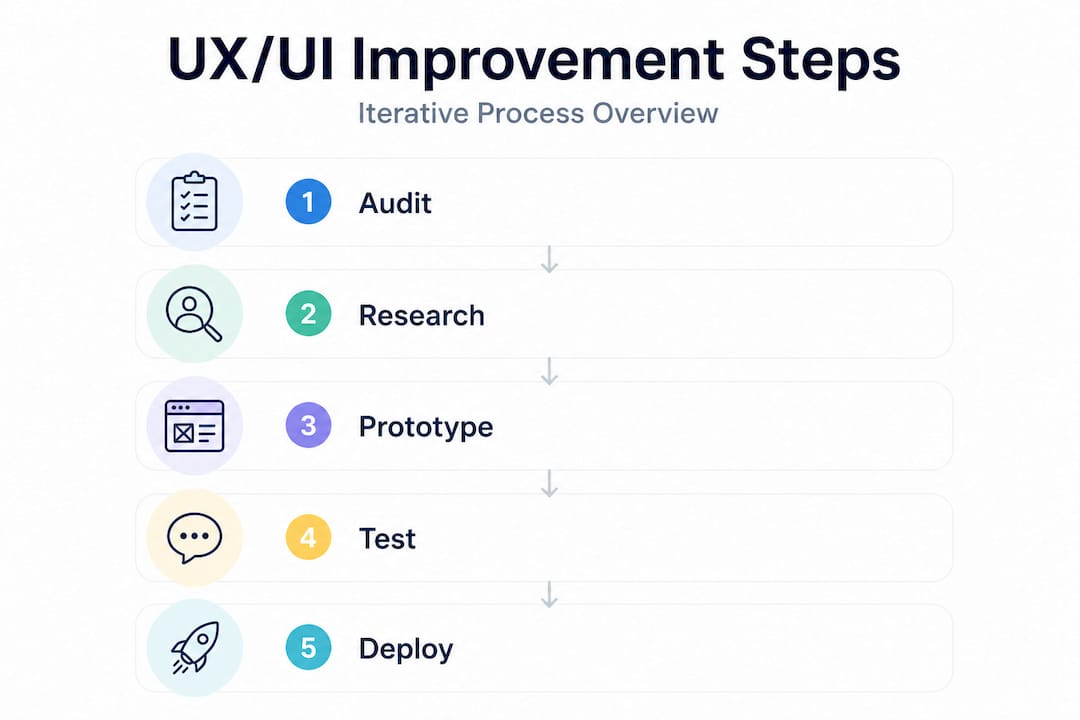
Step-by-step: the iterative UX/UI improvement process
With your tools, team, and requirements in place, you can follow a clear workflow. The key word here is iterative. This is not a single project with a start and end date. It is an ongoing cycle of learning and refinement.
- Audit the current experience. Review analytics, gather qualitative feedback, and map every user journey to identify where people struggle, drop off, or behave unexpectedly.
- Form hypotheses. Based on your audit findings, define specific, testable assumptions. For example: "Users abandon the checkout because the form requires too many fields."
- Prototype solutions. Build low or mid-fidelity prototypes that test your hypotheses without committing to full development. Speed matters here.
- Run user testing. Put prototypes in front of real users from your target audience. Observe, record, and resist the urge to explain or guide them.
- Analyse and iterate. Review what you learned, refine your designs, and test again. Do not skip this loop. One round of testing is rarely enough.
- Deploy incrementally. Release validated changes in small batches. Monitor the impact before moving to the next improvement area.
These design tips for engagement reinforce why each phase matters. Skipping the audit means you are guessing. Skipping user testing means you are building for yourself, not your users.
A common temptation, particularly when an app has accumulated years of technical and design debt, is to scrap everything and start fresh. This is almost always a mistake. Avoiding big-bang redesigns in legacy systems is strongly advised because integrating iteratively manages costs and risks far more effectively. Healthcare and retail systems in particular carry deep integrations, compliance histories, and user habits that a wholesale redesign can disrupt catastrophically.
| Approach | Risk level | Cost profile | Learning opportunity | User disruption |
|---|---|---|---|---|
| Big-bang redesign | Very high | Front-loaded, unpredictable | Low until launch | High |
| Iterative improvement | Manageable | Spread over time | Continuous | Minimal |
The comparison is stark. Iterative approaches allow you to validate assumptions before they become expensive commitments. They also create a culture of continuous improvement within your product team, which compounds over time.
Pro Tip: When in doubt, ship smaller UI tweaks first. A simplified navigation label or a repositioned call-to-action button can have a measurable impact on conversion within days, and it builds the internal confidence to tackle larger improvements. Use iterative feedback in design to keep momentum going between major releases.
Validating changes and measuring success
Shipping improvements is only half the job. Knowing whether they worked is the other half, and it requires a deliberate measurement strategy rather than a hopeful glance at your app store rating.
Rapid validation methods include:
- A/B testing to compare two versions of a screen or flow with real users in production
- Usability lab sessions where observers watch users complete specific tasks and note where they hesitate or fail
- In-app analytics tracking task completion rates, session lengths, funnel drop-offs, and feature adoption
- Net Promoter Score (NPS) surveys capturing overall satisfaction at key moments in the user journey
- Support ticket analysis identifying recurring issues that point to persistent UX problems
Your core KPIs should include user retention rate, task success rate, NPS, time-on-task, and, in regulated sectors, usability compliance marks from formal testing rounds. Tracking these consistently over time gives you a clear picture of whether your improvements are compounding or plateauing.
In healthcare, the validation bar is higher than in other sectors. Formative and summative testing per regulatory standards is required to ensure both safety and usability in clinical applications. Formative testing happens during development to catch problems early. Summative testing happens at the end to confirm the design meets the required standard. Both are essential, and both feed directly into your regulatory submission documentation.
Regulatory usability testing is not just about compliance. It is the most rigorous form of user research available, and the insights it generates improve the experience for every user, not just those in clinical settings.
Balancing qualitative and quantitative measurement is important. Numbers tell you what is happening. Qualitative research tells you why. A retention rate that drops after an update is alarming, but only user interviews will reveal whether it was a confusing new navigation structure, a broken notification flow, or something else entirely. Both lenses are necessary. Relying on analytics alone leads to optimisation without understanding, which is a fragile foundation for sustained improvement. Staying current with UX design trends also helps you benchmark your KPIs against evolving user expectations, not just your own historical performance. A good user feedback strategy ties all of these measurement threads together into a coherent programme.
Why a disciplined, iterative approach beats design-by-committee
Having worked across retail, healthcare, and charity sectors on hundreds of app projects, one pattern stands out with uncomfortable consistency. The projects that go wrong almost always share the same root cause: too many opinions, too little evidence, and a desire to solve everything at once.
Design-by-committee produces apps that try to please everyone and end up serving no one particularly well. A healthcare client once spent eight months in stakeholder alignment meetings debating the colour palette and navigation structure of a patient-facing app. By the time a design was agreed, the original user research was outdated, the regulatory landscape had shifted, and the development team had lost two key members. The eventual launch was underwhelming, and a costly remediation project followed within 18 months.
Contrast that with a retail client who adopted a disciplined iterative approach. They ran fortnightly improvement cycles, each focused on a single user journey. Within six months, basket abandonment had dropped by 23%, and the product team had developed a genuine capability for evidence-led decision-making that continued to deliver results long after the initial engagement ended.
Iterative integration manages risks better than big-bang redesigns, particularly in complex or legacy environments where the cost of getting it wrong is high.
The discipline required is not technical. It is organisational. It means being willing to ship something imperfect, learn from it, and improve. It means trusting user research over internal instinct. And it means resisting the pressure to "just fix everything at once" when the app feels broken.
Small, frequent releases also build resilience. If a change performs poorly, the impact is contained and reversible. If it performs well, you have evidence to justify the next investment. This is how mature product organisations operate, and it is the approach that consistently delivers better outcomes than any single, sweeping redesign. Following a step-by-step improvement framework gives your team the structure to maintain this discipline without losing momentum.
Pro Tip: Set up short, regular review cycles with a cross-functional team that includes someone from UX, development, customer support, and the business side. A 30-minute fortnightly review of key metrics and user feedback is worth more than a quarterly design sprint that produces a long list of improvements nobody has time to implement.
Partner with experts for sustainable app improvements
Putting this process into practice requires more than a good framework. It requires experienced people who have navigated the specific challenges of your sector before.
At Pocket App, we have delivered over 300 mobile projects for clients in retail, healthcare, charity, and beyond. We know where the pitfalls are, how to structure iterative improvement programmes that fit around your existing team, and how to move quickly without cutting corners on quality or compliance. Whether you need a full UX audit and redesign programme or targeted support on a specific user journey, our mobile app development services and app design expertise are built to deliver measurable results. Get in touch to discuss what a structured improvement programme could look like for your app.
Frequently asked questions
What is the first step in improving app UX/UI?
The first step is to conduct a thorough user experience audit, mapping current journeys to identify where users struggle, drop off, or encounter friction before any design work begins.
How can we ensure our improvements comply with healthcare regulations?
Follow FDA guidance by running human factors validation testing with a minimum of 15 users per group, completing both formative and summative assessments in line with IEC 62366 requirements.
Should we redesign our whole app at once or focus on small changes?
An iterative approach is strongly recommended because big-bang redesigns in complex or legacy systems carry high costs and risks that incremental, validated changes avoid entirely.
What metrics should we use to validate UX/UI improvements?
Track user retention, task completion rates, NPS scores, and in-app analytics such as funnel drop-offs and session length to build a complete picture of whether changes are working.
How do we involve users in the improvement process?
Recruit representative users from your target audience early, involve them in prototype testing at each iteration stage, and treat their feedback as the primary evidence base for design decisions rather than a final sign-off step.