
TL;DR:
- Most businesses still design desktops first and adapt layouts for mobile, which harms traffic and rankings. Google's mobile-first indexing makes a mobile experience the primary source for search rankings, emphasizing the importance of mobile-first design. Adopting this approach improves engagement, conversion rates, and accessibility while reducing development complexity and boosting SEO performance.
Most businesses still build their websites by designing the desktop version first, then trying to squeeze everything onto a smaller screen. That backwards approach costs you traffic, rankings, and revenue. Understanding why mobile-first design is crucial means recognising that Google completed mobile-first indexing in July 2024, making your mobile experience the primary version Google sees. Combine that with the reality that over half of all web traffic now comes from mobile devices, and the argument for starting with mobile is no longer a preference. It is a commercial necessity.
Table of Contents
- Key takeaways
- What mobile-first design actually means
- Mobile-first design and SEO: what changed in 2024
- Impact on user experience and engagement
- Practical challenges and how to overcome them
- Business case: mobile-first versus desktop-first
- My honest take on mobile-first in 2026
- Build your mobile-first product with Pocketapp
- FAQ
Key takeaways
| Point | Details |
|---|---|
| Google indexes mobile first | Your mobile page is what Google crawls and ranks, so content parity is non-negotiable. |
| Speed determines engagement | 53% of mobile users abandon a site that takes longer than three seconds to load. |
| Mobile-first improves conversions | Mobile-first sites convert 23% better and have significantly lower bounce rates than desktop-first builds. |
| Accessibility starts on mobile | For many users worldwide, a smartphone is their only means of accessing the internet. |
| Progressive enhancement beats retrofitting | Starting small and scaling up produces leaner, faster, and more focused digital products. |
What mobile-first design actually means
Mobile-first design is a workflow and philosophy, not just a CSS technique. You begin every design decision at the smallest viewport, typically around 375px wide, and progressively enhance the experience as screen size increases. This is the opposite of the traditional desktop-first approach, where you design a full-featured layout and strip it down for mobile.
The distinction matters because the constraints are entirely different. On mobile, you have no hover states, limited screen real estate, unreliable network connections, and users who are often in motion. Those constraints force you to make hard decisions early about what your product genuinely needs. Mobile-first forces prioritisation of indispensable content, which produces cleaner, sharper products across all screen sizes.
Responsive design is often confused with mobile-first, but they are not the same thing. Responsive design describes how a layout adapts to different viewports. Mobile-first describes the direction of that adaptation. You can build a responsive site that starts with desktop and degrades downward. That is not mobile-first. True mobile-first means progressive enhancement starting from mobile essentials and layering complexity upward.
| Approach | Starting point | Design direction | Typical outcome |
|---|---|---|---|
| Desktop-first | Full desktop layout | Scale down for mobile | Bloated mobile experience |
| Responsive only | Either viewport | Adapts both ways | Variable quality on mobile |
| Mobile-first | 375px mobile screen | Scale up for desktop | Lean, focused experience |
Pro Tip: Validate every design decision at 375px before progressing to larger breakpoints. If a layout or feature cannot be justified at the smallest viewport, question whether it belongs in the product at all.
Mobile-first design and SEO: what changed in 2024
Google's shift to mobile-first indexing is the single biggest structural reason why mobile-first design is crucial for any business that depends on organic search. Since July 2024, Google's crawler uses the mobile version of your site as its primary source for crawling, indexing, and determining rankings. If your mobile page hides content that only appears on desktop, Google simply does not see it.
Content parity is therefore non-negotiable. Every piece of text, every structured data block, and every piece of metadata that matters for ranking must be fully present and accessible on your mobile pages. A common mistake is using CSS to hide content on mobile for aesthetic reasons. From Google's perspective, that content does not exist. Mobile-friendly sites rank higher because Google's ranking signals are evaluated against the mobile experience.
Core Web Vitals compound this further. Google measures Largest Contentful Paint, Cumulative Layout Shift, and Interaction to Next Paint primarily on mobile. Sites failing Core Web Vitals face tangible ranking penalties and reduced visibility. Mobile-first design naturally produces better Core Web Vitals scores because minimal initial CSS and JS reduce page weight from the outset, rather than requiring later performance fixes.
Here are the SEO best practices every mobile-first build should follow:
- Serve identical content on mobile and desktop. No hidden text, collapsed sections that Google cannot read, or mobile-only truncated descriptions.
- Include all structured data (Schema markup) on the mobile page, not just the desktop version.
- Use a single URL with responsive design rather than separate mobile subdomains where possible.
- Audit mobile usability in Google Search Console regularly and resolve flagged issues promptly.
- Prioritise a fast First Contentful Paint by deferring non-critical scripts and compressing images for mobile delivery.
Understanding your mobile strategy for business means treating SEO and UX as inseparable, because Google's mobile-first indexing has made them exactly that.
Impact on user experience and engagement
The user experience case for mobile-first is built on a simple truth: people do not tolerate friction on their phones. 53% of mobile users abandon a page that takes more than three seconds to load. That is not a minor inconvenience. That is more than half your potential audience walking away before they see a single pixel of your product.

Mobile-first design addresses this directly. When you start with the smallest viewport, you are forced to define your minimum viable page. You load only what is absolutely needed first and conditionally load additional assets as the user's device and connection allow. This approach, sometimes called progressive asset loading, is the highest-leverage performance technique available to developers.
Beyond speed, the mobile-first user experience reshapes how content is structured and consumed. Vertical scrolling, large touch targets, thumb-friendly navigation, and single-column layouts are not limitations. They are UX patterns that have been validated by billions of daily interactions. Mobile UX expectations have become the global baseline for what a good digital experience looks and feels like.
Accessibility is another critical dimension that mobile-first thinking addresses by default. For a significant proportion of users in both developing and developed economies, a smartphone is their primary or sole internet device. Designing inclusively from the mobile baseline means your product works for those users rather than treating them as an afterthought. You can explore this further through Pocketapp's guidance on app accessibility design.
Pro Tip: Set a performance budget before you write a single line of front-end code. Define maximum file sizes, acceptable load times, and Core Web Vitals targets for mobile. Then test on real devices, not just browser emulators, because emulators consistently overestimate real-world performance.
The business outcomes follow naturally. Better speed, clarity, and accessibility translate directly into lower bounce rates, higher time on site, and improved conversion rates. A well-considered UX improvement process that starts from mobile produces measurably better results than one that retrofits mobile as an afterthought.
Practical challenges and how to overcome them
Adopting mobile-first requires rethinking interaction primitives that desktop-first designers take for granted. There are no hover states on a touchscreen. Right-click context menus do not exist. Dropdown navigation menus that expand on cursor proximity become completely non-functional on touch devices. Early validation of touch affordances and tap targets is not optional. It needs to happen at the start of the design process, not as a late-stage QA task.
Here are the practical steps that move a team from desktop-first habits to genuine mobile-first execution:
- Start every project with a mobile content audit. List what the user genuinely needs to accomplish on mobile and design around that list. Anything not on the list is a candidate for deferral to larger viewports.
- Define minimum tap target sizes early. Apple's Human Interface Guidelines recommend 44 x 44 points. Google recommends 48 x 48 density-independent pixels. Build these constraints into your design system from day one.
- Write CSS with a mobile-first media query structure. Base styles apply to mobile. Use "min-width
breakpoints to enhance for tablets and desktops, notmax-width` breakpoints to strip things back. - Conditionally load heavy assets. Use lazy loading for images, defer non-critical JavaScript, and use the
srcsetattribute to serve appropriately sized images to different devices. - Test on real devices under real network conditions. Use Chrome DevTools network throttling as a starting point, but validate on physical handsets on 4G and 3G connections before any release.
- Audit for content hiding. Run a mobile versus desktop content comparison to confirm nothing ranking-critical is hidden or truncated on mobile.
The most common mistake is what might be called the desktop-first trap: teams who claim to work mobile-first but still sketch full desktop wireframes first, then adapt them. The design direction has to genuinely start small. If your Figma file opens to a 1440px frame, you are not working mobile-first.
Business case: mobile-first versus desktop-first
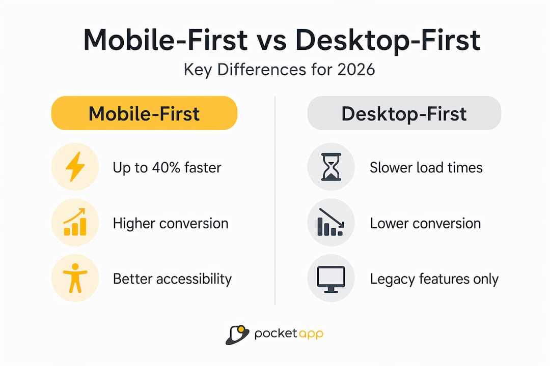
The performance differential between mobile-first and desktop-first sites is well-documented and striking. Mobile-first sites load 40% faster, convert 23% better, and have 67% lower bounce rates than their desktop-first equivalents. For any business dependent on digital revenue, those are not incremental gains. They are the difference between a product that performs and one that quietly bleeds users.
| Metric | Mobile-first | Desktop-first |
|---|---|---|
| Average load speed | Up to 40% faster | Slower due to excess assets |
| Conversion rate | 23% higher | Baseline |
| Bounce rate | 67% lower | Baseline |
| Google ranking signals | Evaluated on mobile UX | Desktop UX largely irrelevant |
| Accessibility coverage | Broader by default | Often requires retrofit |
The advantages of mobile-first design extend beyond the technical. Businesses that build mobile-first signal to their audience that they understand how people actually use technology today. That trust affects brand perception as much as it affects bounce rates.
The benefits for business growth include:
- Higher organic search visibility through better mobile Core Web Vitals scores.
- Lower customer acquisition costs when conversion rates improve.
- Broader audience reach, particularly among users for whom mobile is the primary device.
- Reduced development debt over time, because mobile-first builds are leaner and easier to maintain than retrofitted desktop sites.
You can find a detailed breakdown of mobile UX benefits across sectors, including retail, healthcare, and charities, in Pocketapp's sector-specific analysis.
My honest take on mobile-first in 2026
I have watched teams debate whether mobile-first is worth the workflow change for years. My view now is that framing it as a workflow change fundamentally underestimates what it actually is. It is a change in how you think about your users and what your product exists to do.
Desktop-first thinking assumes your user is settled, patient, and probably at a desk. That assumption was questionable ten years ago. In 2026 it is simply wrong for most products and audiences. When I look at projects where mobile-first was applied genuinely, not as a checkbox but as a founding principle, the results are consistently better. Faster load times. Cleaner interfaces. Lower drop-off rates. More engaged users.
The resistance I hear most often is that desktop users get a worse experience if you start mobile. That has not been my experience at all. Starting small forces better decisions. Those decisions improve the desktop experience too because they remove complexity that was never serving users in the first place.
The teams that get the most out of mobile-first are not the ones who master the CSS media query structure first. They are the ones who genuinely ask, at the very beginning, what does this user need right now, on this device, in this context? That question changes everything. For designers, developers, and business owners alike, mobile-first is foundational to building products that actually work.
— Paul
Build your mobile-first product with Pocketapp
If the principles above resonate but the execution feels daunting, Pocketapp has been building mobile-first products for over a decade with a portfolio of more than 300 projects for brands including WWF, Dechra, and Crocus.
Pocketapp's end-to-end services cover mobile app development and professional app design grounded in mobile-first principles from discovery through to deployment. Whether you need a native app built correctly from the ground up or a cross-platform solution that performs consistently across devices, the team combines technical depth with genuine UX expertise. The result is digital products that load fast, rank well, and keep users engaged. Speak to the Pocketapp team about your next project and see what genuinely mobile-first development delivers.
FAQ
What is mobile-first design?
Mobile-first design is a workflow where you design and build for the smallest screen first, then progressively enhance the experience for larger viewports. It is the opposite of desktop-first design, which scales down from a full desktop layout.
Why does mobile-first design matter for SEO?
Google completed its mobile-first indexing rollout in July 2024, meaning your mobile page is now the version Google primarily crawls and uses for ranking. Any content absent from your mobile page is effectively invisible to Google's index.
How does mobile-first design affect conversion rates?
Mobile-first sites convert 23% better than desktop-first equivalents, largely because they load faster, present content more clearly, and reduce the friction that causes users to abandon a session before completing an action.
Is responsive design the same as mobile-first design?
No. Responsive design describes how a layout adapts across screen sizes. Mobile-first describes the direction of that adaptation, starting from the smallest screen and scaling up. A site can be responsive without being mobile-first.
What are the most common mobile-first design mistakes?
The most frequent mistake is claiming to work mobile-first while still sketching full desktop layouts first. Other common errors include hiding content on mobile for aesthetic reasons, ignoring touch target sizing, and testing only on browser emulators rather than real devices.