
TL;DR:
- Downloads indicate user interest but do not reveal engagement or retention metrics essential for app success. Structured analytics uncover user behaviors, drop-offs, and feature impacts, guiding deliberate product improvements. Focusing on meaningful KPIs and maintaining a disciplined, prioritized approach ensures accurate insights and effective decision-making.
Most businesses celebrate a spike in downloads without asking what happens next. Downloads tell you someone clicked "install." They tell you nothing about whether that person completed onboarding, made a purchase, booked an appointment, or ever returned. The real story of your app's performance lives inside the product, in the events, flows, and drop-offs that only structured analytics can surface. For product managers and decision-makers in retail, healthcare, and nonprofits, understanding that story is the difference between iterating with confidence and guessing in the dark.
Table of Contents
- Understanding the role of analytics in mobile apps
- How structured event taxonomy powers actionable analytics
- Funnels and retention: turning analytics into user engagement strategies
- Measurement edge cases and common pitfalls in mobile analytics
- Choosing the right KPIs: avoiding vanity metrics and focusing on impact
- A fresh perspective: why less is more with mobile app analytics
- Unlock analytics-driven mobile app development with Pocket App
- Frequently asked questions
Key Takeaways
| Point | Details |
|---|---|
| Event tracking clarity | Consistent event taxonomy enables precise measurement and trustworthy analytics insights. |
| Funnel analysis value | Understanding user drop-off points drives targeted improvements and higher retention. |
| Avoiding vanity metrics | Focus on KPIs that connect directly to business outcomes, not superficial data points. |
| Sector-specific strategies | Retail, healthcare, and nonprofit sectors benefit from tailored analytics approaches for user engagement. |
| Measurement pitfalls | Regularly validate analytics setup to avoid errors that impact decision-making. |
Understanding the role of analytics in mobile apps
Analytics in mobile apps goes far beyond counting sessions. At its core, it is the practice of capturing structured data about how people interact with your product, then using that data to make deliberate decisions about design, features, and marketing.
Mobile app analytics gives product and marketing teams the ability to measure engagement and business outcomes through event-based tracking, retention curves, funnel and conversion reporting, and release performance monitoring, as Firebase Analytics documents in its core reporting framework. That covers a wide spectrum. Event-based tracking means recording a specific action, such as a button tap or a form submission, every time it occurs. Retention curves show the percentage of users who return on day one, day seven, and day thirty after first install. Conversion funnels reveal how many users complete a multi-step process from start to finish.
"What you measure shapes what you build. If you only measure installs, you will keep optimising for installs."
The practical value of this data is substantial. Knowing that 70% of your retail app users abandon the checkout screen on step three does not just highlight a problem — it points directly to where your next sprint should focus. Knowing that healthcare app users who complete an onboarding tutorial are twice as likely to return after thirty days tells you onboarding is worth investing in. Analytics transforms intuition into evidence.
Key things analytics can reveal include:
- Who is using your app, broken down by device type, geography, or acquisition channel
- When users are most active and which sessions are longest
- Where users drop off within critical user journeys
- What features drive the most return visits
- Why certain cohorts retain better than others, based on their onboarding path or feature adoption
How structured event taxonomy powers actionable analytics
Event taxonomy is the naming and organisational system you use to define what your app tracks and why. Think of it as the grammar of your analytics setup. Without consistent grammar, sentences become noise.
A well-designed event taxonomy, combined with event and user properties, gives you the ability to answer "who did what, when, and with what context," which is the foundation of meaningful segmentation and funnel analysis, as Amplitude's data taxonomy guidance makes clear. In practice, this means every tracked action has a consistent name, a clear purpose, and attached properties that add context.
Consider a healthcare app. Rather than logging a generic "button_click" event, a structured taxonomy would log "appointment_booked" with properties such as "appointment_type," "time_to_next_available," and "user_segment." That single event now answers multiple questions at once.
| Poor taxonomy | Strong taxonomy |
|---|---|
| button_click | appointment_booked |
| screen_view | onboarding_step_completed |
| user_action | product_added_to_basket |
| generic_event | donation_submitted |
Poor instrumentation, where events are named inconsistently or tracked without properties, leads directly to unreliable dashboards. Your team will spend hours debating whether "page_view" and "screen_view" refer to the same thing instead of acting on insights. Governance matters enormously here, particularly as teams grow and multiple developers contribute to the codebase.
Pro Tip: Create a data dictionary before you write a single line of tracking code. Document every event name, its trigger condition, and its required properties. This single document prevents months of confusion and rework later.
Applying structured taxonomy also enables the kind of big data insights that move product strategy forward. When your events are clean and consistent, you can segment users by behaviour rather than just demographics, which is far more predictive of future actions.
Key principles for a reliable event taxonomy:
- Use verb_noun naming conventions (e.g., "video_played," "profile_updated")
- Attach at least three contextual properties to every event
- Limit the total number of custom events to what your team can act on
- Review and audit the taxonomy every quarter as features evolve
Funnels and retention: turning analytics into user engagement strategies
Funnel analysis and cohort retention are where analytics stops being theoretical and starts being operational. These two tools are arguably the most powerful in a product manager's toolkit.
A funnel tracks users through a defined sequence of steps. A retail checkout funnel might include: product view, add to basket, enter delivery details, enter payment, confirm order. Each step shows a percentage of users who continued from the previous one. The step with the biggest percentage drop is your priority.
Funnel and retention analysis helps teams pinpoint where users drop off and which cohorts retain better, which drives iterative improvements to UX and product design. The key word there is "iterative." You rarely solve a drop-off with one change. You hypothesise, test, measure, and adjust.
Cohort analysis groups users by a shared characteristic, typically the week or month they first installed the app, and tracks their behaviour over time. This is valuable because it isolates the impact of product changes. If you redesigned onboarding in March, cohorts who installed in April should show better retention than those who installed in February — if the redesign worked.
Here is a simplified retention benchmark table for context:
| Day | Typical retention (consumer apps) | Strong retention (consumer apps) |
|---|---|---|
| Day 1 | 25% | 40%+ |
| Day 7 | 10% | 20%+ |
| Day 30 | 5% | 10%+ |
To turn these numbers into action, follow a structured diagnostic process:
- Identify the drop-off point within your most critical funnel
- Segment the drop-off by user type, device, or acquisition channel to find patterns
- Replay the user journey using session recordings or heatmaps to see what users actually encounter
- Hypothesise a cause based on what you observe, not what you assume
- Test a specific change with A/B testing or a phased rollout
- Measure the cohort after the change and compare against the baseline
Improving app UX for retention is not about redesigning everything. It is about identifying the one friction point that most users encounter and removing it. Similarly, mastering app feedback can surface qualitative context that explains what the quantitative data shows.
"Retention is not a metric you improve by accident. It improves when product teams treat every drop-off as a diagnostic signal rather than an inevitable loss."
Measurement edge cases and common pitfalls in mobile analytics
Even a well-instrumented app can produce misleading data if you are not aware of the technical quirks that affect mobile analytics. These edge cases are rarely discussed in strategy articles, but they cause real problems in practice.
Mobile analytics must account for measurement edge cases including tracking limitations, attribution and cohort artefacts, and event implementation issues. A common example is day-zero retention not reaching 100%, which seems impossible but occurs because of processing delays or duplicated event records. If you see this in your dashboard and do not understand why, you might draw entirely wrong conclusions about your app's initial performance.
Other common pitfalls include:
- Attribution errors: A user installs after seeing a social media post and a paid search ad. Which channel gets credit? Without a clear attribution model, your marketing spend data becomes unreliable
- Delayed event firing: Some events fire late due to network conditions or SDK batching, skewing time-based analysis
- Duplicated events: If the same event fires twice because of a race condition in the code, your conversion rates will look artificially high
- Session definition inconsistencies: Different analytics platforms define a "session" differently. Comparing session counts across tools without accounting for this leads to false conclusions
- Sampling in large datasets: Some analytics platforms sample data at scale, meaning your reports reflect a statistical estimate rather than every actual event
Pro Tip: Set up automated anomaly alerts in your analytics platform. If daily active users suddenly drop by 30% or a conversion event count doubles overnight, you want to know immediately rather than discovering it in a weekly review. App performance monitoring is as important as behavioural analytics.
Validating your instrumentation before launch and after every significant code change is non-negotiable. Spend time keeping users engaged by ensuring the data you act on is trustworthy, not corrupted by implementation errors that went undetected.
Choosing the right KPIs: avoiding vanity metrics and focusing on impact
Downloads are the most cited vanity metric in mobile. They feel impressive in board presentations but reveal nothing about whether your app is delivering value. The same applies to total registered users and raw session counts. These figures can grow while your actual engaged user base shrinks.

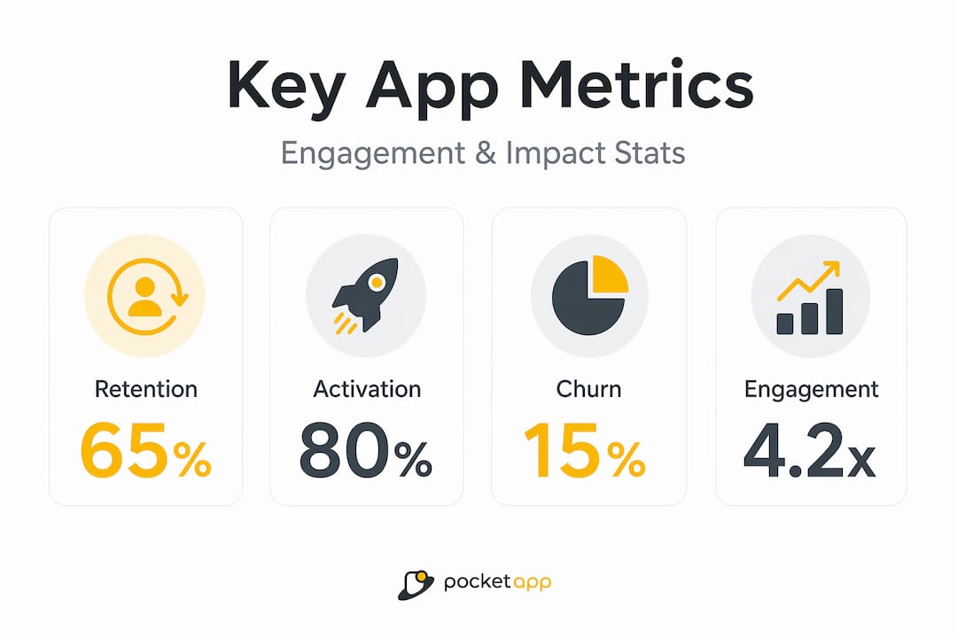
Leading KPI frameworks consistently emphasise retention, churn, activation, and engagement as the metrics that drive operational decisions and reflect real business outcomes, rather than surface-level vanity metrics. These metrics also translate directly into action.
The most impactful KPIs by sector look quite different:
- Retail: Conversion rate, basket abandonment rate, average order value, return purchase rate
- Healthcare: Onboarding completion rate, appointment booking rate, day-30 retention, feature adoption among target patient groups
- Nonprofit: Return visit rate, donation conversion, campaign action rate, volunteer sign-up completion
What unites these across sectors is that each metric connects to a specific user behaviour and a specific business outcome. User experience optimisation starts with knowing which metric you are trying to move and why it matters to your organisation's goals.
A practical framework for selecting KPIs involves three questions:
- Does this metric change when the user experience improves?
- Does it connect to revenue, safety, or mission fulfilment?
- Can my team take a specific action based on a change in this number?
If the answer to any of these is no, the metric is decorative rather than functional. Mobile app branding and engagement strategies both benefit enormously when grounded in metrics that actually reflect user commitment rather than passive installation.
| Sector | Vanity metric | Meaningful metric |
|---|---|---|
| Retail | Total downloads | Checkout completion rate |
| Healthcare | App store rating | Day-30 active users |
| Nonprofit | Total registrations | Donation conversion rate |
A fresh perspective: why less is more with mobile app analytics
There is a common instinct in product teams to track everything. The logic sounds reasonable: more data means more insight. In practice, this creates what we call a "dashboard graveyard," a collection of charts nobody interprets and metrics nobody acts on.
As UXCam's analysis of mobile app KPIs illustrates, some guidance encourages tracking dozens of KPIs, but experienced practitioners consistently warn that over-instrumentation crowds dashboards and obscures the handful of metrics that are actually predictive of retention and revenue outcomes. The signal disappears in the noise.
We have seen this pattern repeatedly across sectors. A retail client arrives with forty custom events and no clear ownership of the data. A healthcare team has three different definitions of "active user" living in separate systems. A nonprofit is measuring campaign impressions but not tracking whether those impressions led to a single donation.
The solution is not more sophisticated tooling. It is disciplined prioritisation. Pick five to seven mobile analytics insights that connect directly to your current product goals. Review them weekly. Build a culture of acting on what the data says rather than commissioning another report.
Trustworthy analytics also depends on robust data modelling and validation. A metric is only as reliable as the instrumentation behind it. Over-instrumented systems are harder to validate, more prone to breaking during app updates, and more likely to produce the kind of inconsistencies that erode confidence in data across the whole organisation. Start small, validate thoroughly, and expand your tracking as your team's analytical maturity grows.
Unlock analytics-driven mobile app development with Pocket App
Analytics strategy is only as powerful as the app it is built into. If your tracking architecture is retrofitted onto a product that was built without measurement in mind, you will always be playing catch-up.
At Pocket App, we design and build mobile applications with analytics embedded from the discovery phase, not bolted on at the end. Whether you need to overhaul an existing product's measurement framework or build a new app with retention and conversion baked into its core, our team brings over 300 projects of experience across retail, healthcare, and nonprofit sectors. Explore our approach to mobile app development and see how purpose-built app design solutions translate analytics thinking into real user outcomes. Get in touch to discuss how we can help your organisation make decisions with confidence.
Frequently asked questions
What are the most important analytics metrics for mobile apps?
Retention, churn, activation, and engagement are the leading KPIs because they directly reflect whether users find ongoing value in your app, making them far more meaningful than surface-level metrics like total downloads.
How do retail, healthcare, and nonprofit sectors use analytics differently?
Retail teams use analytics to measure conversion flows and reduce funnel drop-off; healthcare teams optimise patient engagement and track milestone adherence; nonprofit teams treat activation and return visits as proxies for mission impact and fundraising readiness.
How can product managers avoid vanity metrics?
Focus on metrics that change when your user experience improves and connect directly to a business outcome, such as retention or conversion rate, rather than passive counts like downloads or page views that do not reflect genuine user commitment.
What should I do if analytics data looks incorrect or inconsistent?
Start by validating your instrumentation against known user actions in a test environment, then check for common data issues such as duplicated events, processing delays, or inconsistent event naming that can distort cohort and retention metrics.