
Apps with poorly designed user flows lose 25% of users within 24 hours, yet many product managers and designers still conflate user flows with user journeys or overlook critical edge cases. Understanding user flow is not just about mapping a happy path, it's about creating a systematic framework that guides users through every decision, error, and alternate route within your mobile app. This guide clarifies what user flow truly means, demonstrates how to design effective flows that boost retention and conversion, and equips you with practical methodologies to measure and iterate your designs for commercial success.
Table of Contents
- Understanding User Flow In App Design
- How To Design Effective User Flows For Mobile Apps
- Designing For Edge Cases And Beyond The Happy Path
- Measuring And Iterating User Flows With Data
- Partner With Pocket App For Expert App Design And Development
- FAQ
Key takeaways
| Point | Details |
|---|---|
| User flow maps task completion | It's a visual diagram showing the specific steps users take to achieve goals within your app |
| Design for all scenarios | Include error states, permissions conflicts, and edge cases, not just the ideal path |
| Optimised flows drive retention | Well-designed user flows can improve conversion rates by up to 400% and significantly reduce churn |
| Measurement enables iteration | Use funnels, heatmaps, and session replays to identify drop-off points and refine flows continuously |
| Flow differs from journey | User flow is task-focused whilst user journey encompasses the broader emotional experience |
Understanding user flow in app design
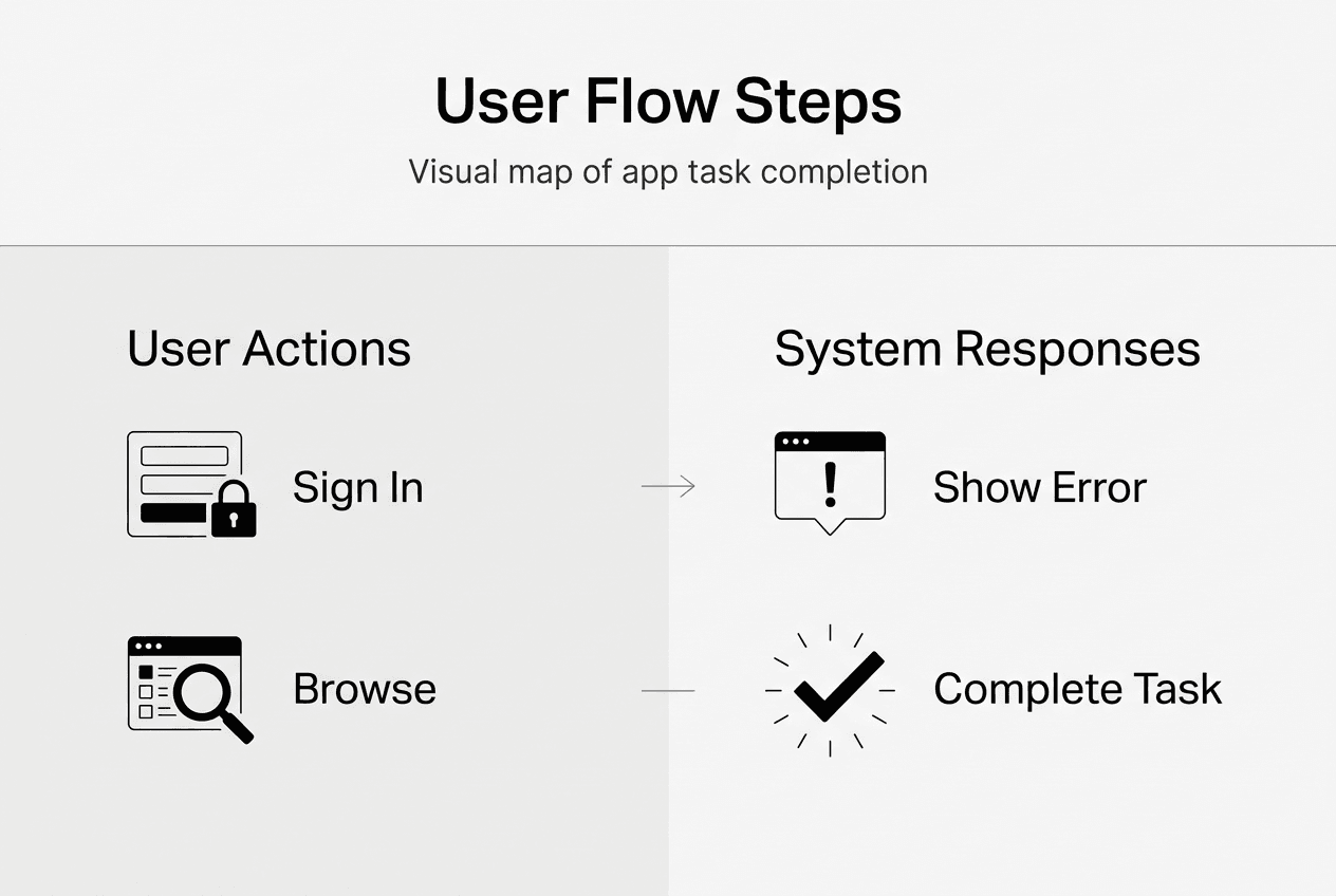
User flow in app design is a visual diagram mapping the path users take through an app to complete tasks, including branches for choices and errors. Think of it as a blueprint that anticipates every decision point, screen transition, and potential obstacle a user might encounter whilst pursuing a specific goal. Unlike a simple linear wireframe, user flows account for the reality that users make choices, encounter errors, abandon tasks, and return through different entry points.
Why does this matter for mobile app design principles? Because mapping all paths, including branches for decisions and errors, reveals friction points before they frustrate real users. When you design a checkout flow, for example, you must consider what happens when payment fails, when users lack required information, or when they navigate away mid-process. Each branch represents a potential drop-off point that requires thoughtful design intervention.
The distinction between user flow and related concepts often causes confusion. User flow is task-focused, it concentrates on the specific steps required to complete an action like signing up, making a purchase, or sharing content. User journey, by contrast, is holistic, encompassing the entire experience including emotional states, pain points, motivations, and touchpoints across multiple sessions or channels. A user journey might span weeks and include app store discovery, onboarding, daily usage, and eventual churn or advocacy.
Wireflows represent a hybrid approach, combining user flows with screen wireframes to show both the path and the interface at each step. This format helps stakeholders visualise not just where users go, but what they see and interact with along the way. Understanding these distinctions matters because each serves different design and communication purposes. Product managers need user flows to identify bottlenecks and prioritise features, whilst designers use wireflows to prototype interactions and validate interface decisions with users.
Pro Tip: Create separate user flows for each primary user goal rather than attempting to map your entire app in one diagram. This focused approach makes flows easier to analyse, test, and iterate without overwhelming complexity.
How to design effective user flows for mobile apps
Creating user flows that genuinely serve users and business objectives requires a systematic approach grounded in clear goals and iterative refinement. Key methodologies include defining goals, mapping happy paths, adding decision branches, using tools like Figma, testing for redundancies, and iterating based on data. Here's how to implement this framework effectively:
-
Define clear goals and entry points. Before drawing a single box or arrow, articulate exactly what users need to accomplish and where they might begin. Entry points vary widely, users might arrive from a push notification, a deep link, the app icon, or mid-flow after backgrounding the app. Each entry point potentially requires different context or state management.
-
Map the primary happy path first. Document the ideal sequence of steps assuming everything works perfectly and users make optimal choices. This establishes your baseline flow and helps you understand the minimum viable path. For a food delivery app, the happy path might be: open app, browse restaurants, select items, checkout, confirm order, track delivery.
-
Layer in decision branches and alternatives. Real users don't follow scripts. Add branches for every meaningful choice, such as new versus returning users, different payment methods, or optional features. Each decision point creates divergent paths that eventually converge or lead to different outcomes.
-
Use specialised tools for visualisation. Figma and Lucidchart enable collaborative creation of wireflows that integrate user flows with interface mockups. These platforms support version control, commenting, and stakeholder review, making them invaluable for team alignment and iteration. Choose tools that fit your existing workflow rather than learning complex new systems.
-
Test flows to eliminate redundancies. Walk through each path asking whether every step adds value or merely creates friction. Can you reduce the number of screens? Combine input fields? Pre-fill information from previous sessions? Smarter onboarding flows often succeed by removing unnecessary steps rather than adding clever features.
-
Analyse behaviour data for continuous improvement. User flow design doesn't end at launch. Examine funnel analytics to identify where users abandon tasks, review heatmaps to understand interaction patterns, and watch session replays to spot confusion or frustration. These insights reveal gaps between your intended flow and actual user behaviour, enabling targeted refinements.
Pro Tip: Focus each flow on a single user goal to avoid complexity that obscures analysis and makes iteration difficult. If you're tempted to map multiple goals in one diagram, create separate flows instead and link them at logical transition points.
The most effective user flows balance simplicity with completeness. They guide users efficiently towards goals whilst anticipating realistic complications. Iterative app design treats flows as living documents that evolve based on user feedback and behavioural data rather than static artefacts created once during initial development.
Designing for edge cases and beyond the happy path
The happy path represents perhaps 60% of actual user experiences, the remaining 40% involves errors, edge cases, and unexpected scenarios that determine whether users persevere or abandon your app in frustration. Design beyond the happy path to include error handling, permissions conflicts, offline modes; treat edges as primary design problems, not afterthoughts.

Planning for error and empty states is integral to user flow, not optional polish. Error states occur when actions fail due to network issues, invalid input, server problems, or conflicts with existing data. Empty states appear when users encounter screens with no content, such as a new user viewing their order history or a search returning zero results. Both scenarios require clear communication, actionable next steps, and graceful recovery paths that maintain user confidence.
Common pitfalls in user flow design often stem from optimistic assumptions:
- Ignoring alternate paths. Assuming users always grant permissions, maintain connectivity, and complete tasks in one session leads to flows that break under real-world conditions.
- Overcomplication. Adding excessive decision branches, optional features, or conditional logic creates cognitive overload and increases the surface area for bugs.
- Lack of recovery options. When errors occur, users need clear paths to retry, seek help, or safely exit without losing progress or data.
- Inconsistent patterns. Using different navigation paradigms or interaction models across flows forces users to relearn conventions and increases cognitive load.
Edge cases worth explicit consideration in mobile apps include permission denials for camera, location, or notifications, offline usage when connectivity drops mid-task, partial data from interrupted syncs or failed uploads, account state transitions like expired subscriptions or locked accounts, and device-specific constraints such as low storage or outdated operating systems. Each represents a realistic scenario that affects real users regularly.
The impact of thoughtful edge case design extends beyond user satisfaction. Apps that handle errors gracefully reduce customer support volume by enabling self-service recovery. They improve retention by preventing frustration-driven uninstalls. They build trust by demonstrating reliability under adverse conditions. Conversely, apps that crash, lose data, or provide cryptic error messages train users to avoid features or abandon the app entirely.
Pro Tip: Treat edge case flows as equal in priority to the main flow by allocating design and development resources proportionally and testing them as rigorously as happy paths. This mindset shift transforms edge cases from technical debt into competitive advantages.
Consider top considerations for mobile apps that influence edge case design, including platform conventions, device capabilities, and user context. Mobile users face interruptions, variable connectivity, and diverse device configurations that desktop users rarely encounter. Your flows must accommodate this reality through progressive disclosure, optimistic UI updates, background syncing, and clear state management.
Measuring and iterating user flows with data
Designing user flows based on intuition and best practices provides a solid foundation, but empirical measurement transforms good flows into exceptional ones. Empirical benchmarks show average mobile app retention rates and the impact of flow friction on drop-off and conversion rates, revealing opportunities for targeted improvement.
Key retention benchmarks provide context for evaluating your flows. Day 1 retention averages around 25%, meaning three-quarters of users who install your app never return for a second session. Day 7 retention typically falls to 12-18%, and Day 30 retention hovers around 5-8%. These stark figures underscore the importance of frictionless onboarding and core task flows. Even minor improvements in early-session experiences compound dramatically over the user lifecycle.
| Metric | Industry Average | Impact of Optimised Flow |
|---|---|---|
| Day 1 Retention | 25% | +10-15 percentage points |
| Day 7 Retention | 12-18% | +5-8 percentage points |
| Cart Abandonment | 70-85% | -20-30 percentage points |
| Conversion Rate | Baseline | +200-400% |
High cart abandonment rates, often 70-85% in mobile commerce, frequently result from unnecessary flow friction such as mandatory account creation, excessive form fields, unclear shipping costs, or complicated payment interfaces. Optimised UX flows can boost conversions up to 400% by removing these obstacles and streamlining the path from intent to completion.
Practical measurement and iteration steps:
- Implement funnel analytics to track progression through multi-step flows and identify exact drop-off points where users abandon tasks.
- Deploy session replay tools to watch actual user interactions, revealing confusion, misclicks, and unexpected behaviour patterns.
- Analyse heatmaps to understand which elements attract attention and which go ignored, informing layout and hierarchy decisions.
- Conduct A/B tests on flow variations to quantify the impact of changes before full rollout.
- Monitor error rates for specific steps or screens to prioritise bug fixes and usability improvements.
- Survey users who abandon flows to understand qualitative reasons behind quantitative drop-offs.
Iterate flows continually based on data insights for ROI maximisation. User behaviour evolves as your app matures, competitors launch features, and market expectations shift. Flows that performed well six months ago may now create friction as users develop new mental models or encounter superior experiences elsewhere. Regular review cycles, quarterly at minimum, ensure your flows remain competitive and aligned with user needs.
The connection between flow optimisation and business outcomes is direct and measurable. Reducing onboarding friction increases activation rates, which correlate strongly with long-term retention. Streamlining purchase flows boosts revenue per user. Simplifying content creation flows increases engagement and network effects. Each improvement compounds over time as more users successfully complete tasks and return for additional sessions.
Measuring ROI in app development requires connecting user flow metrics to business KPIs such as customer lifetime value, acquisition cost recovery time, and revenue growth. This linkage justifies continued investment in UX refinement and helps prioritise which flows deserve attention based on potential impact rather than subjective preferences.
Partner with Pocket App for expert app design and development
Understanding user flow principles equips you to evaluate and improve your mobile app's UX, but implementing sophisticated flows requires specialised expertise in design, development, and iterative refinement. Pocket App offers comprehensive mobile app development tailored to user-centric flows that drive retention and conversion.
With over 300 projects across retail, healthcare, charity, and consumer sectors, Pocket App's expert design team ensures seamless, engaging user experiences grounded in proven methodologies. They support iterative mobile app improvements informed by user data, transforming theoretical knowledge of user flows into commercial success. Whether you're launching a new app or optimising an existing product, partnering with specialists who understand the nuances of flow design, edge case handling, and data-driven iteration accelerates your path to market leadership.
FAQ
What is the difference between a user flow and a user journey?
User flow maps task-specific steps users take to complete actions within your app, focusing on navigation, decisions, and screen transitions. User journey encapsulates the overall experience including emotions, pain points, motivations, and touchpoints across multiple sessions or channels. Flows are tactical and screen-level, whilst journeys are strategic and experience-level.
Why is designing beyond the happy path important?
Real users encounter errors and edge cases frequently due to connectivity issues, permission denials, invalid inputs, and interrupted sessions. Designing for these scenarios ensures smoother recovery, reduces support costs, and prevents frustration-driven uninstalls. Apps that handle edge cases gracefully build user trust and competitive advantage.
What tools are best for creating user flows?
Figma and Lucidchart are widely used for flow diagrams and wireflows due to their collaborative features and integration capabilities. These tools support team alignment, stakeholder review, version control, and iteration. Choose platforms that fit your existing workflow rather than adopting complex systems that create adoption friction.
How can user flow analysis improve app retention?
Flow analysis identifies drop-off points causing user churn by revealing where friction, confusion, or errors interrupt task completion. Refining flows based on this data improves engagement and completion rates, directly impacting retention metrics. Even small improvements in early-session flows compound dramatically over the user lifecycle, as evidenced by smarter onboarding strategies that reduce Day 1 churn.