
Mobile devices now account for 64% of global web traffic, yet countless apps still fail to adapt properly across different screens. When your app doesn't respond to varying device sizes, you're not just creating a poor user experience, you're actively losing customers. This guide explains what responsive app design truly means, why it's essential for UK businesses, and how to implement it effectively to boost engagement and revenue.
Table of Contents
- Key takeaways
- Understanding responsive app design
- Addressing challenges and edge cases in responsive design
- Responsive vs adaptive design: what UK businesses should know
- Benefits and practical application for UK businesses
- How we help UK businesses master responsive app design
- Frequently asked questions
Key Takeaways
| Point | Details |
|---|---|
| Definition and mechanics | Responsive app design automatically adjusts layout content and functionality based on device size using fluid grids flexible images and media queries. |
| Three core components | Fluid grids rely on relative units such as percent em or rem, flexible images scale within their containers and media queries apply device specific rules. |
| UK business benefits | The guide notes that responsive design boosts engagement and revenue for UK organisations. |
| Practical implementation guidance | Begin with a mobile first approach and test by resizing the browser to reveal awkward intermediate states. |
Understanding responsive app design
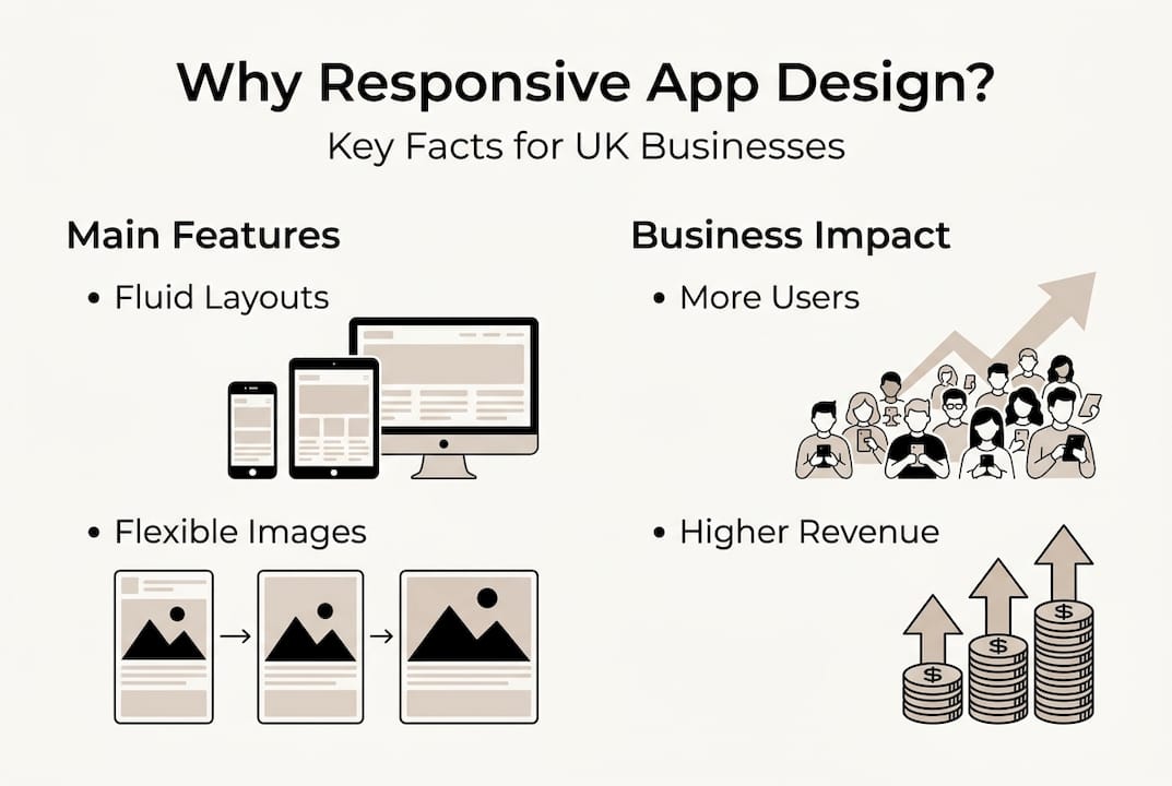
Responsive app design means your application automatically adjusts its layout, content, and functionality based on the device accessing it. Rather than building separate versions for each screen size, responsive design uses flexible grids, scalable images, and media queries to create one codebase that works everywhere. This approach relies on conditional logic that detects screen dimensions and applies appropriate styling rules in real time.
The core mechanics involve three essential components working together. Fluid grids use relative units like percentages, em, or rem rather than fixed pixels, allowing layouts to expand or contract proportionally. Flexible images scale within their containers without breaking layouts or causing horizontal scrolling. Media queries detect device characteristics such as screen width, orientation, and resolution, triggering specific CSS rules or component behaviours when conditions are met.
Modern apps must accommodate an expanding range of device categories. Smartphones range from compact 4-inch screens to large 6.7-inch displays. Tablets span 7 to 13 inches with varying aspect ratios. Foldable devices introduce dynamic screen sizes that change as users open or close them. Desktop and laptop screens present entirely different interaction paradigms with mouse input and larger viewports. Each category demands thoughtful consideration in your user flow in app design.
A mobile-first approach prioritises the smallest screens during initial development, then progressively enhances for larger displays. This strategy ensures core functionality works on constrained devices before adding features for tablets and desktops. Common breakpoints typically occur around 320px for small phones, 768px for tablets, 1024px for small laptops, and 1440px for larger desktop displays. Popular frameworks like Bootstrap, Material-UI, and Tailwind CSS provide pre-built responsive components and grid systems that handle these breakpoints automatically.
Pro Tip: Test your responsive layouts by resizing your browser window continuously rather than just checking fixed breakpoints. This reveals awkward in-between states where content might overlap or spacing becomes uncomfortable, helping you create truly fluid designs.
Addressing challenges and edge cases in responsive design
Foldable devices present unique complications because screen dimensions change dynamically during use. Your app must detect fold events and reorganise content instantly without crashing or losing user state. Dynamic UI elements like modals, drawers, and floating action buttons need careful positioning to avoid awkward placements when screens expand or contract. Navigation patterns that work beautifully on standard phones may become clumsy on unfolded tablets.

Performance constraints hit hardest on low-end devices with limited processing power and memory. Loading large images or running complex animations that perform smoothly on flagship phones can cause stuttering and crashes on budget models. Throttled network connections in rural UK areas compound these issues, making efficient asset delivery critical. Lazy loading images, code splitting, and optimising bundle sizes become essential rather than optional enhancements.
Accessibility requirements demand specific minimum sizes that directly impact responsive layouts. Touch targets under 48px cause significantly higher abandonment rates because users struggle to tap accurately. Font sizes below 16px reduce readability and increase bounce rates by approximately 20%. Colour contrast ratios must meet WCAG standards across all themes and screen sizes. These constraints aren't limitations, they're opportunities to create better experiences for everyone, as detailed in our guide on accessible mobile apps.
Orientation changes between portrait and landscape modes require thoughtful layout adjustments. Content that stacks vertically in portrait might need to flow horizontally in landscape to utilise available width effectively. Video players, image galleries, and data tables particularly benefit from landscape optimisations. Legacy browser support adds another layer of complexity, especially when supporting older Android devices still running outdated WebView versions.
Testing represents perhaps the greatest challenge because you cannot simply rely on browser emulators or simulators. Real devices behave differently due to hardware variations, manufacturer customisations, and operating system quirks. You need to test over 1000 configurations to capture meaningful edge cases, though cloud-based device labs and automated testing tools help manage this scale. Prioritise testing on devices your actual users own by analysing analytics data to identify the most common models and operating system versions.
Pro Tip: Create a device testing matrix that includes at least one budget Android phone, one mid-range device, one flagship phone, one tablet, and one foldable if your budget allows. This coverage captures the majority of responsive design issues without requiring dozens of devices.
Responsive vs adaptive design: what UK businesses should know
The fundamental difference lies in how each approach handles device diversity. Responsive design uses fluid layouts that scale continuously across any screen size using a single codebase. Adaptive design creates multiple fixed layouts optimised for specific device categories, detecting the user's device and serving the most appropriate version. Think of responsive as a liquid that fills any container, while adaptive is like having separate containers for different purposes.
Responsive design offers significant advantages for scalability and search engine optimisation. One codebase means easier maintenance, faster feature rollouts, and lower development costs over time. Search engines favour responsive sites because they present consistent content across devices without duplicate URLs. The approach handles new device sizes automatically without requiring updates, making it future-proof as screen dimensions continue evolving. Wide device support comes naturally since the fluid layout adapts to anything.
Adaptive design excels at delivering tailored user experiences and optimised performance for specific devices. Each layout version can leverage device-specific features and interaction patterns, creating more polished experiences. Performance optimisation becomes easier because you can tune assets and code precisely for each device category. However, this approach demands higher maintenance effort as you must update multiple layout versions when making changes. Development costs increase proportionally with the number of device categories you support.
A hybrid approach recommended for Flutter and React Native apps combines the best of both worlds. Use responsive principles for your core layout structure with fluid grids and flexible components. Apply adaptive techniques selectively for critical UI elements that benefit from device-specific optimisation, such as navigation patterns, input methods, and media handling. This balanced strategy delivers excellent user experiences without excessive maintenance overhead.
For UK businesses targeting both iOS and Android users, cross-platform frameworks make hybrid approaches particularly cost-effective. You maintain one primary codebase that handles responsive scaling, then add platform-specific adaptations only where they genuinely improve the experience. This pragmatic middle ground often delivers the best return on investment, especially for organisations with limited development resources. Consider your specific user base, budget constraints, and long-term maintenance capacity when choosing your approach, as explored in our article on innovation in app design 2026.
| Aspect | Responsive design | Adaptive design | Hybrid approach |
|---|---|---|---|
| Implementation | Single fluid layout scales continuously | Multiple fixed layouts per device | Responsive foundation with selective adaptive elements |
| Maintenance effort | Lower, one codebase to update | Higher, multiple versions to maintain | Moderate, focused optimisations |
| Performance | Good, may load unnecessary assets | Excellent, optimised per device | Very good, balanced efficiency |
| User experience | Consistent across devices | Tailored to each device | Polished with smart compromises |
| Development cost | Lower initial and ongoing | Higher initial and ongoing | Moderate, best ROI for most UK businesses |
| Best for | Content-heavy apps, broad device support | Performance-critical apps, specific devices | Cross-platform business apps with Flutter or React Native |
Pro Tip: Start with a responsive approach and add adaptive elements only where analytics reveal specific device categories struggling with the default experience. This data-driven strategy prevents over-engineering whilst addressing real user pain points.
Benefits and practical application for UK businesses
The business case for responsive app design rests on quantifiable improvements across key metrics. Mobile-first responsive design boosts conversions by an average of 58% compared to non-responsive alternatives. Bounce rates drop by approximately 23% when users encounter properly adapted layouts that feel native to their devices. Session duration increases as frustration decreases, leading to deeper engagement with your content and features.
UK businesses have documented impressive returns from responsive implementations. Tesco reported 12% revenue growth after redesigning their mobile app with responsive principles, directly attributing increased sales to improved cross-device experiences. Kingfisher saw similar results with their B&Q and Screwfix apps, where responsive layouts reduced customer service contacts by 18% as users found information more easily. These aren't isolated successes, they represent a consistent pattern across retail, healthcare, and service sectors.
Practical implementation for UK organisations follows a structured approach that minimises risk whilst maximising impact. First, audit your current app analytics to identify device distribution, screen sizes, and user behaviour patterns across different form factors. This data reveals where responsive improvements will deliver the greatest value. Second, adopt a mobile-first development methodology that ensures core functionality works perfectly on constrained devices before enhancing for larger screens.
Third, choose appropriate frameworks and tools that accelerate responsive development. Flutter and React Native both offer excellent responsive capabilities with hot reload for rapid iteration. Material Design and Human Interface Guidelines provide proven responsive patterns you can adapt rather than inventing from scratch. Fourth, integrate analytics tracking that segments user behaviour by device category, screen size, and orientation. This ongoing measurement lets you refine your responsive implementation based on real usage data.
Fifth, establish a testing protocol that covers your primary device categories with both automated and manual testing. Automated visual regression testing catches layout breaks quickly, whilst manual testing on real devices reveals subtle interaction issues that emulators miss. Sixth, iterate continuously based on user feedback and analytics insights. Responsive design isn't a one-time project, it's an ongoing optimisation process as devices evolve and user expectations rise.
| Metric | Before responsive design | After responsive design | Improvement |
|---|---|---|---|
| Mobile conversion rate | 2.3% | 3.6% | +58% |
| Bounce rate | 48% | 37% | -23% |
| Average session duration | 2.1 minutes | 3.4 minutes | +62% |
| Customer satisfaction score | 3.2/5 | 4.1/5 | +28% |
| Support tickets (navigation issues) | 340/month | 124/month | -64% |
Beyond direct sales metrics, responsive design delivers competitive advantages that compound over time. Users increasingly expect seamless experiences across devices, and apps that fail to deliver feel outdated regardless of their actual age. Your brand perception improves when interactions feel polished and professional on any device customers use. Employee productivity increases for internal business apps when staff can work effectively whether they're at a desk, in a meeting with a tablet, or checking updates on their phone. These softer benefits prove difficult to quantify but significantly impact long-term business success, as discussed in our guide on mobile app design experience.
For UK businesses planning new app projects or considering redesigns in 2026, responsive design should be a non-negotiable requirement rather than an optional enhancement. The proliferation of device types shows no signs of slowing, and users have lost patience with apps that don't adapt properly. Start by defining clear success metrics tied to business outcomes, then design your responsive implementation to move those specific needles. With proper planning and execution, responsive app design transforms from a technical requirement into a genuine competitive advantage, as outlined in our app development tips 2026.
How we help UK businesses master responsive app design
Building truly responsive apps requires specialised expertise that many UK businesses lack in-house. We've spent over a decade perfecting mobile app development for organisations across retail, healthcare, charity, and enterprise sectors. Our team understands the nuances of creating apps that feel native on every device whilst maintaining a single, cost-effective codebase.
Our cross-platform mobile app development approach combines responsive principles with platform-specific optimisations, delivering the hybrid benefits discussed earlier without the typical maintenance overhead. We've helped over 300 UK businesses increase revenue and user engagement through thoughtful mobile application design that prioritises responsive excellence from day one. Whether you're launching a new app or improving an existing one, we can help you implement responsive design that directly impacts your bottom line.
Frequently asked questions
What is responsive app design?
Responsive app design is an approach where applications automatically adjust their layout, content, and functionality based on the device screen size and orientation. It uses flexible grids, scalable images, and media queries to create one codebase that works seamlessly across phones, tablets, foldables, and desktops. This eliminates the need for separate app versions whilst ensuring optimal user experiences on every device.
How does responsive app design benefit UK businesses?
Responsive design directly improves business metrics by increasing conversion rates, reducing bounce rates, and extending session duration as users enjoy better experiences across all their devices. UK companies like Tesco have documented double-digit revenue growth after implementing responsive mobile apps. The approach also reduces development and maintenance costs compared to building separate versions for different devices, making it particularly valuable for organisations with limited budgets.
What are the main challenges when implementing responsive design?
The primary challenges include handling the vast array of device sizes and configurations, from compact phones to large tablets and foldable devices with dynamic screens. Ensuring accessibility standards like minimum touch target sizes and readable fonts adds complexity to layout decisions. Extensive testing across real devices proves essential because emulators cannot replicate all hardware variations and manufacturer customisations that affect how apps actually behave in users' hands.
Should UK businesses choose responsive, adaptive, or hybrid design?
Responsive design works best for most UK businesses because it offers broad device support, easier maintenance, and better search engine optimisation with a single codebase. Adaptive design suits performance-critical applications where device-specific optimisation justifies the higher development and maintenance costs. However, a hybrid approach combining responsive foundations with selective adaptive elements delivers the best balance for cross-platform business apps built with modern frameworks like Flutter or React Native, providing excellent experiences without excessive complexity.