TL;DR:
- Mobile giving now surpasses desktop donations for UK charities, but many apps remain poorly optimized for mobile experiences. Enhancing fast load times, accessible interfaces, simplified donation flows, and empathetic, inclusive design significantly increases donor engagement and retention. Ongoing user testing and personalization strategies further strengthen the relationship between charities and supporters.
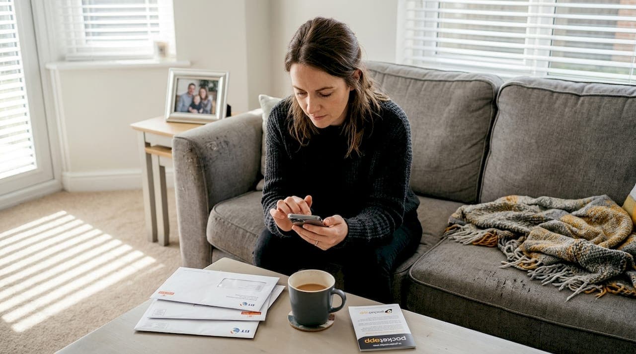
Mobile giving has overtaken the desktop for many UK charities, yet most fundraising apps still treat the phone screen as an afterthought. Over 45% of donations now happen on mobile devices, and every clunky form field or slow-loading screen quietly kills donor intent. The good news is that targeted, evidence-backed UX improvements can meaningfully lift conversion rates, improve retention, and turn one-off givers into committed supporters.
Table of Contents
- Optimise for mobile-first experiences
- Streamline donation flows for higher conversions
- Design with empathy: user-centred and inclusive principles
- Use clear calls to action and impact-driven language
- Enhance retention with personalisation and positive emotional design
- What most charities get wrong about charity app UX
- Take your charity app's user experience further
- Frequently asked questions
Key Takeaways
| Point | Details |
|---|---|
| Mobile-first design essential | Apps must prioritise fast, responsive layouts and clear, tappable buttons to maximise donations. |
| Streamlined donation flows | Limiting forms to three fields and using impact evidence can significantly increase contributions. |
| Focus on accessibility | Accessible design supports more users and builds trust, benefiting both donors and charities. |
| Personalisation boosts retention | Tailored updates and gamified recognition encourage repeat giving and long-term loyalty. |
| Simple, clear messaging wins | Clear calls to action and plain language outperform jargon and clutter in engaging supporters. |
Optimise for mobile-first experiences
The shift in donor behaviour is not subtle. Mobile-first design means responsive layouts, fast load times under three seconds, and wide, high-contrast buttons that eliminate unnecessary friction. When a supporter opens your app on the bus, waiting five seconds for a page to load is enough to close the session entirely.
Button sizing is a surprisingly consequential detail. Tap targets should sit between 44 and 48 pixels to accommodate a range of thumb sizes and reduce misfires. Tiny buttons that require precise finger placement frustrate users and erode confidence in the overall experience. Likewise, high-contrast text (think dark text on a pale background) ensures readability across different lighting conditions, from bright outdoor settings to dim indoor environments.
| Design element | Best practice | Impact on giving |
|---|---|---|
| Button size | 44 to 48px tap target | Reduces misfires and drop-off |
| Load time | Under 3 seconds | Lowers bounce rate significantly |
| Colour contrast | Minimum 4.5:1 ratio | Improves readability for all users |
| Layout | Single-column, scrollable | Reduces cognitive overload |
For charity leaders looking at broader donor engagement strategies, speed and layout work together as a foundation. Neither works particularly well in isolation. The mobile UX benefits for charities extend beyond aesthetics because they directly influence whether a supporter completes a donation or abandons the process.
Key areas to prioritise in your mobile-first audit:
- Test your app on low-end Android devices as well as the latest iPhone models
- Use real-world network conditions (3G and 4G) to simulate donor environments
- Ensure all interactive elements are reachable within the natural thumb zone
- Remove any decorative images that slow load times without adding meaning
Pro Tip: Run a five-second test with a small group of supporters. Show them your donation screen for five seconds, then ask what they remembered. If they cannot recall the primary action, your visual hierarchy needs reworking.
Our optimisation guide explores these principles in greater depth, including practical checklists for charity app teams working with limited development resource.
Streamline donation flows for higher conversions
Just as layout and speed influence first impressions, the donation process itself can make or break a supporter's intent to give. Reducing form fields from seven to three boosts completion rates by 15 to 30%. Three fields is the sweet spot: name, email address, and payment details. Anything beyond that is friction in disguise.
"The most effective donation forms feel almost invisible. A supporter should be able to give in under 60 seconds without wondering what comes next." This principle shapes every form we recommend to charity clients.
Optimised donation forms can boost revenue by over 60% compared to unoptimised equivalents. That figure sounds dramatic until you consider how many charities still use multi-page forms with mandatory account creation steps.
Here is a practical sequence for structuring high-converting donation flows:
- Present three or four suggested donation amounts tied to tangible outcomes. For example, £10 provides a hot meal, £25 covers one night of emergency shelter, and £50 funds a week of counselling sessions.
- Add a progress bar for any multi-step process. Supporters who can see they are on step two of three are significantly more likely to continue than those facing an undefined journey.
- Auto-focus on the first active field when the donation screen loads. This removes one tap and gently guides the user forward.
- Offer Apple Pay and Google Pay alongside card entry. Digital wallets dramatically reduce the time spent on payment details, which is the stage where most abandonment occurs.
- Follow every successful donation with an immediate, personalised confirmation that reinforces impact rather than just acknowledging a transaction.
Recurring giving prompts deserve special attention. Presenting a monthly giving option at the point of checkout, rather than as a separate campaign, can double the number of donors who opt into sustained support. The key is framing: "Give £10 once" versus "Give £10 monthly and help us plan ahead" positions recurrence as a genuine partnership.
For teams focused on driving mobile donations, the donation flow is the single highest-leverage area in the entire app. Time spent increasing form completion rates will consistently outperform time spent on visual redesigns that do not address structural friction.
Pro Tip: A/B test your suggested donation amounts every quarter. Amounts that worked during a winter campaign may not resonate during a summer appeal. Small changes in anchoring can shift average gift sizes noticeably.
Design with empathy: user-centred and inclusive principles
Empathy and accessibility drive trust, but communication style and feedback also carry considerable weight in the donor experience. User-Centred Design (UCD) places real donor needs at the heart of every decision, cutting waste by ensuring teams build what supporters actually need rather than what internal stakeholders assume they want.
Involving donors in your design process does not require a large research budget. Even three to five informal interviews with existing supporters can surface friction points that analytics alone would never reveal. Ask people to complete a donation while thinking aloud, and you will quickly identify where confidence wavers.
WCAG accessibility standards require at least a 4.5:1 colour contrast ratio, full keyboard navigation support, and compatibility with screen readers. For charities serving users in crisis, such as mental health organisations or homelessness services, reducing cognitive load and visual complexity becomes even more critical.
Inclusive design priorities for UK charity apps:
- Write all copy at a maximum reading age of twelve. Use short sentences and plain words
- Avoid sector jargon entirely. Terms like "unrestricted funds" or "Gift Aid uplift" mean nothing to a first-time donor
- Provide translations for communities where English is not a first language
- Ensure all images have meaningful alt text, not just "image" or file names
- Test with users who have motor impairments, visual impairments, and cognitive differences
Our resources on accessible app design and inclusive design strategies offer practical frameworks that go beyond compliance and focus on genuine usability for every supporter. You can also explore our app accessibility best practices guide for a more detailed technical overview.
Pro Tip: Commission a short accessibility audit before any major app update. Many accessibility barriers are invisible to non-disabled users but block disabled supporters from completing a donation entirely. This is both an ethical obligation and a measurable revenue opportunity.
The app design workflows that work best for charities always embed accessibility testing from the earliest prototyping stage rather than treating it as a final checklist item.
Use clear calls to action and impact-driven language
Beyond empathy in design, language itself is a conversion tool. Clear, concise impact statements placed in strong Z-pattern positions improve both engagement and conversion rates. The Z-pattern describes how users naturally scan a screen: from top left to top right, then diagonally to bottom left, finishing at bottom right. Placing your primary call to action at the bottom right of that path puts it exactly where the eye lands naturally.
Impact-driven language replaces abstract appeals with concrete outcomes. "Help us make a difference" is vague. "Your £30 today provides three nights of safe accommodation" is specific, credible, and motivating. The specificity signals that the organisation is accountable and that the donor's contribution has a defined destination.
Effective calls to action in charity apps share a few common characteristics:
- They use active, positive verbs: "Give now," "Support tonight," "Join the movement"
- They avoid guilt-based framing, which erodes long-term loyalty even when it produces short-term results
- They appear at natural decision points rather than interrupting the user journey
- They are large enough to tap comfortably and visually distinct from surrounding content
Post-donation communication is an underused retention tool. A thank-you screen that tells a supporter "You just funded three meals for a family in Leeds" reinforces the decision to give and increases the likelihood of a repeat donation. Suggesting a meaningful next action, such as sharing the campaign or signing up for impact updates, channels positive emotion into further engagement.
Pro Tip: Avoid the word "donate" wherever possible. Research consistently shows that action-oriented alternatives like "give," "help," or "support" outperform "donate" in click-through tests. The word "donate" carries transactional connotations, whereas "help" signals partnership.
For additional engagement ideas that connect language strategy with broader app design decisions, we have covered practical approaches that charity teams can implement without a full product redesign.
Enhance retention with personalisation and positive emotional design
Having covered the core design principles, the next frontier for charity apps is retention, and this is where personalisation and emotional design create genuine competitive advantage. Real-time impact updates and badges for recurring gifts measurably boost donor retention compared to generic acknowledgement emails.
Consider what happens when a monthly donor receives a push notification that reads: "Because of your support this month, we housed 12 families in Birmingham." That notification is fundamentally different from "Thank you for your £10 donation." The first builds an ongoing relationship. The second processes a transaction.
Tailored notifications and rounded visual elements promote warmth and a sense of generosity, both of which are associated with prosocial behaviour. Research into visual design psychology confirms that rounded shapes feel more approachable and trustworthy than angular alternatives, a subtle but meaningful distinction in charity app design.
| Personalisation approach | Generic alternative | Expected outcome |
|---|---|---|
| Named impact update | Generic thank-you message | Higher repeat donation rate |
| Milestone badge for 6-month giving | No acknowledgement | Stronger long-term commitment |
| Tailored notification based on past gift | Blanket campaign message | Improved open and click rates |
| Rounded, warm visual design | Angular, corporate aesthetic | Greater perceived approachability |
Gamification works well when it reinforces genuine real-world impact and works poorly when it feels like a gimmick. A giving streak tracker that shows "You've supported us for 8 months in a row" is meaningful. A leaderboard ranking donors against strangers is intrusive and potentially alienating.
Explore our thoughts on boosting donor retention and gamification insights for a more nuanced look at which mechanics actually work in charity contexts.
Pro Tip: Map the full emotional journey a donor takes from first app open to post-donation confirmation. Identify every moment where anxiety, confusion, or hesitation could appear. Those are the moments where warm design, clear language, and reassuring feedback make the biggest difference.
What most charities get wrong about charity app UX
Here is an uncomfortable observation: most charity apps fail not because of a lack of features, but because of an excess of them. The instinct to add more, more donation types, more content sections, more social sharing options, consistently undermines the clarity that converts interest into action.
We have worked across a wide range of digital products, and the pattern is consistent. Organisations that invest in simplifying their donor journey outperform those that invest in expanding their feature set. A donor who is slightly confused is a donor who does not give. Confusion is not neutral; it actively destroys goodwill.
The second mistake is treating UX as a one-off project rather than an ongoing discipline. A single redesign with no subsequent user testing locks in assumptions that quickly become outdated as donor expectations shift. Iterative prototyping, even with small sample groups, catches issues before they affect revenue.
The charities that win long-term loyalty build apps that feel human. They use plain language, warm visuals, and feedback that acknowledges the emotional significance of giving. They treat the mobile screen not as a payment terminal but as a relationship channel. Our step-by-step design guide for nonprofit app development reflects this philosophy at every stage, from discovery through to post-launch iteration.
The most powerful UX investment any charity can make is sustained, empathetic attention to what real donors actually need in the moment they decide to give.
Take your charity app's user experience further
If these principles have highlighted gaps in your current app experience, the natural next step is a structured conversation about what a better donor journey could look like for your organisation.
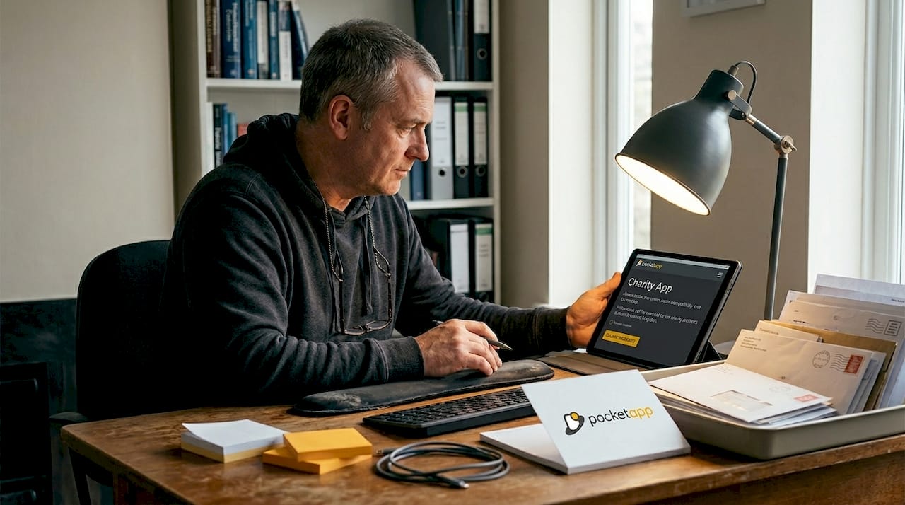
At Pocket App, we specialise in bespoke mobile app development for charities and nonprofits, from initial discovery and UX strategy through to full build and deployment. Our professional app design process begins with understanding your donors, not just your brief. With over 300 projects delivered, including work for WWF and other third-sector organisations, we know what it takes to create mobile experiences that inspire genuine generosity. Reach out to arrange a discovery call and start building an app that works as hard as your team does.
Frequently asked questions
What is the ideal donation form length for charity apps?
The best-performing forms use just three fields: name, email, and payment details. Reducing fields from seven to three lifts completion rates by up to 30%.
How can we make our charity app accessible to all users?
Ensure at least a 4.5:1 colour contrast ratio, provide full keyboard navigation, and support screen readers to meet WCAG standards and maximise inclusivity.
Does personalisation really increase donor retention?
Yes. Real-time impact updates and milestone badges for recurring gifts measurably boost retention rates compared to generic acknowledgement messages.
What mobile benchmarks should our charity app meet?
Aim for over 8% conversion on mobile, a bounce rate below 40%, donation completion times under 60 seconds, and page load times under three seconds.
How important is mobile-optimised design compared to desktop?
Mobile is now the primary giving channel for most UK charities. However, desktop users give higher average donation amounts, so a strong cross-platform strategy remains worthwhile.