
TL;DR:
- Charities improve donor engagement by designing mobile-friendly, accessible websites with streamlined donation processes. Regular testing, clear messaging, and user-centered features increase conversions and support long-term supporter retention. Prioritizing accessibility and continuous optimization benefits both legal compliance and fundraising success.
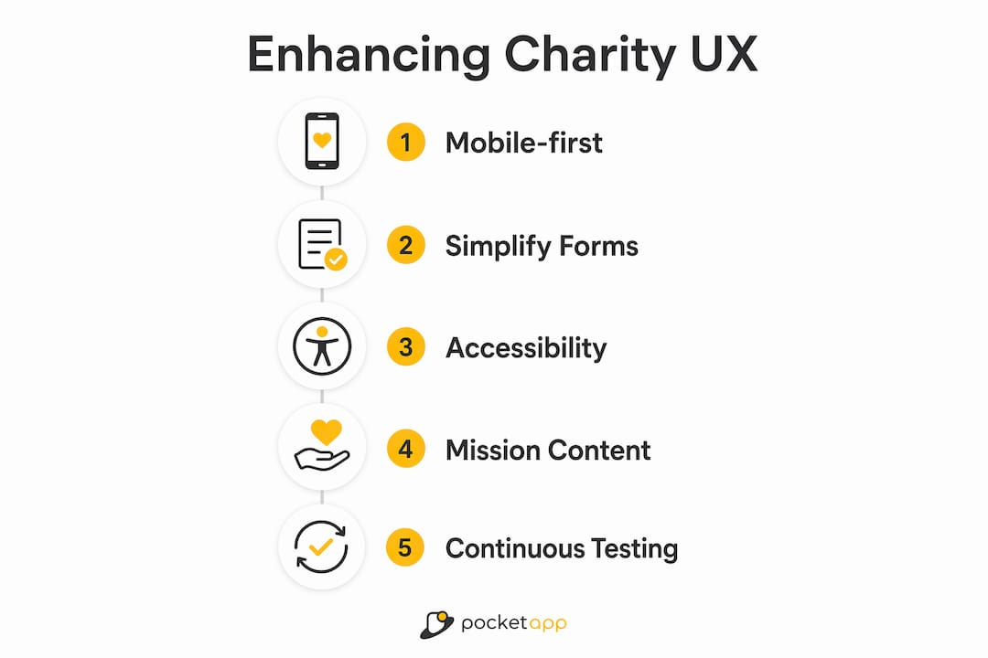
Enhancing UX for charities means creating accessible, mobile-friendly platforms that convert visitors into donors and keep supporters engaged long after their first visit. User experience (UX) is the recognised industry term for every interaction a person has with your digital platform, from landing on your homepage to completing a donation. Charities that treat UX as a core discipline, not an afterthought, consistently outperform those that do not. Mobile traffic exceeds 60% of nonprofit website visits, yet mobile conversion rates lag significantly behind desktop. That gap is where donations are lost, and closing it is the single highest-leverage opportunity most charities have right now.
How to enhance UX for charities through better donation processes
The donation form is the most critical page on any charity website. Every unnecessary field, confusing label, or missing payment option is a reason for a supporter to abandon the process entirely.
Reduce form steps to three or fewer
Limiting form steps to three can double completion rates, moving conversion from 12% to as high as 24%. That is not a marginal gain. It is the difference between a struggling campaign and a funded one. Strip your form back to the essentials: amount, personal details, and payment. Move gift aid declarations and newsletter sign-ups to a confirmation page instead.

Use persistent labels, not placeholder text
Placeholder text inside form fields causes abandonment because it disappears the moment a donor starts typing. Persistent labels placed above each input field stay visible throughout the process. They also work correctly with screen readers, which matters for accessibility compliance. Label every form control programmatically so assistive technologies can identify it without ambiguity.
Integrate digital wallets
Nearly 40% of one-off donations are now made via digital wallets such as Apple Pay and Google Pay. Supporters on mobile devices expect to complete a donation in two taps. Charities that do not offer digital wallet integration create a barrier that reduces donation volume significantly. Adding these options is a technical change with a direct revenue impact.
Test on real devices
- Open your donation form on a physical smartphone in a dimly lit room.
- Complete the form with one hand while distracted.
- Note every moment of friction: small tap targets, disappearing labels, slow loading.
- Repeat on both iOS and Android devices.
- Fix the issues you find before running any paid campaigns.
Testing on real devices exposes keyboard traps and interaction problems that emulators simply cannot replicate. Donors give in real-world conditions, so test in real-world conditions.
Pro Tip: Run an A/B test on your donation page CTA button text. "Donate now" versus "Give £10 today" can produce meaningfully different results. Track both with GA4 event goals and let data decide.
What role does mobile optimisation play in charity website UX?
Mobile is the primary channel for charity website traffic, and it is where most charities lose donors. Mobile converts 27% less than desktop, with an 8% mobile conversion rate compared to 11% on desktop. That gap represents real money left uncollected. Closing it requires deliberate mobile-first design decisions, not just a responsive layout.
The core principles of mobile UX for charities are straightforward:
- Large tap targets. Buttons and links must be at least 44 x 44 pixels. Smaller targets cause mis-taps and frustration.
- Single-column layouts. Multi-column designs break on small screens. A single column keeps content readable without zooming.
- Fast load times. Every additional second of load time reduces conversion. Compress images and defer non-critical scripts.
- Streamlined navigation. Reduce the number of menu items visible on mobile. Prioritise "Donate" above all other links.
- Mobile payment integration. Apple Pay and Google Pay remove the need to type card details on a small keyboard.
Mobile UX improvements can unlock significant revenue increases for charities that have previously treated mobile as a secondary concern. The supporters most likely to donate impulsively after seeing a social media post are on their phones. If your mobile experience fails them at that moment, the donation does not happen.
Pro Tip: Use Google's PageSpeed Insights to score your donation page on mobile. A score below 70 means donors are waiting. Aim for 85 or above before your next fundraising campaign.
Why should charities prioritise accessibility in their UX design?
Accessibility is not optional. The 2026 WCAG 2.2 Level AA standard sets the legal and ethical baseline for all digital platforms, including charity websites. Meeting it protects your organisation legally and opens your platform to a wider audience of potential donors.
The three non-negotiable requirements under WCAG 2.2 AA are a 4.5:1 colour contrast ratio for text, descriptive alternative text for all meaningful images, and full keyboard navigation of every interactive element including forms and menus. Each requirement addresses a real group of users who cannot access your content without it.
Accessibility improvements also boost SEO rankings, which means more organic traffic from supporters searching for causes to support. The two goals reinforce each other. A site that works for a screen reader user also tends to work better for search engine crawlers.
| Accessibility requirement | What it means in practice |
|---|---|
| 4.5:1 colour contrast ratio | Check text against background colour using a free contrast checker tool |
| Alt text for meaningful images | Write a short description of what the image shows, not what it represents |
| Keyboard navigation | Tab through your entire site and confirm every element is reachable |
| Programmatic form labels | Every input field must have a label tag linked by a matching "for" attribute |
| Decorative image handling | Set alt="" on images that carry no information so screen readers skip them |
Plan accessibility from the start of any redesign project. Retrofitting it after launch costs significantly more time and money than building it in from day one.
How can mission-focused content improve supporter engagement?
Donor trust is built in the first few seconds on your homepage. Clear mission statements in plain English paired with authentic photography create emotional connection faster than any design trend. Supporters want to know immediately what you do, who you help, and why it matters. Jargon and abstract language undermine that connection.
The most effective charity homepages share several characteristics:
- A single, plain-English mission statement in the hero section, no longer than two sentences.
- Authentic photographs of real people your charity supports, not stock imagery.
- An impact story that shows a specific outcome, not a general claim.
- A visible, persistent "Donate" call to action that does not require scrolling to find.
- Consistent branding and tone across every page, email, and social channel.
Donor-centric information architecture built through card sorting produces navigation structures that match how supporters think, not how your internal teams are organised. Card sorting involves asking real donors to group pages and label categories themselves. The results frequently differ from what charity staff expect. Use those results to restructure your navigation.
Recurring giving deserves its own visible pathway. Many charities bury monthly giving options inside a single donation form. A dedicated "Give monthly" page with its own navigation link and a clear explanation of impact per month consistently outperforms a checkbox on a one-off form.
What methods can charities use to improve UX over time?
A charity website is a living tool, not a finished product. Treating donation forms as dynamic assets with ongoing testing and refinement is the practice that separates high-performing nonprofit digital teams from those that plateau after a redesign.
- Define conversion goals before any update. Decide what success looks like before you change anything. Is it form completion rate, average donation value, or monthly donor sign-ups? Set a baseline, then measure against it.
- Implement GA4 event tracking. Track every click on your donation button, every form start, and every form completion as a separate GA4 event. This reveals exactly where donors drop off.
- Add heatmaps to key pages. Heatmap tools show where supporters click, scroll, and stop reading. They surface problems that analytics alone cannot explain.
- Run quarterly A/B tests. Test one variable at a time: button colour, headline copy, suggested donation amounts, or form layout. A 10% improvement in form completion can mean thousands of pounds more annually for a mid-sized charity.
- Collect donor feedback directly. A short exit survey on your donation confirmation page asking "Was anything unclear?" costs nothing and surfaces friction points no analytics tool will find.
Update your content regularly. Outdated impact statistics and old campaign imagery signal neglect to potential donors. Schedule a content audit every quarter alongside your UX review. Pair the UX optimisation process with a content calendar to keep both moving forward together.
Key takeaways
Charities that combine mobile-first design, streamlined donation forms, WCAG 2.2 AA accessibility, and data-driven continuous testing consistently convert more visitors into donors.
| Point | Details |
|---|---|
| Simplify donation forms | Limit steps to three and use persistent labels to double completion rates. |
| Prioritise mobile experience | Mobile converts 27% less than desktop; close the gap with large tap targets and digital wallets. |
| Meet WCAG 2.2 AA standards | A 4.5:1 contrast ratio, alt text, and keyboard navigation are legal and ethical requirements in 2026. |
| Lead with mission clarity | Plain-English mission statements and authentic photography build donor trust within seconds. |
| Test and iterate continuously | Quarterly A/B tests and GA4 tracking turn your website into a consistently improving fundraising tool. |
What I have learned from charity UX projects
The most common mistake I see charity digital teams make is designing for themselves rather than for their donors. Internal navigation structures, sector jargon in headlines, and donation forms built around back-office data requirements all reflect the organisation's needs, not the supporter's. The fix is not a bigger budget. It is a shift in perspective.
Real-device testing changes everything. I have watched charity staff sit down with a physical phone for the first time and immediately spot problems that had been invisible on their desktop screens for months. A button too small to tap reliably. A form that locks the keyboard on iOS. A contrast ratio that makes text unreadable in sunlight. These are not edge cases. They are the conditions under which real donors give.
The charities that improve fastest treat their charity app UX and website as products, not projects. A project ends. A product evolves. The teams that schedule quarterly reviews, run A/B tests as a matter of routine, and bring in donor feedback regularly are the ones that see sustained growth in online giving. Accessibility and consistency matter as much as aesthetics. A beautifully designed site that fails a keyboard user or loads slowly on a budget Android phone is not doing its job.
— Paul
Pocketapp: mobile development built for charity engagement
Charities that want to close the mobile conversion gap need more than a responsive website. A dedicated mobile app, built with donor behaviour at its centre, creates a direct channel for giving, impact updates, and recurring engagement that a browser cannot replicate.
Pocketapp has delivered over 300 mobile projects across charity, healthcare, and retail sectors, including work for WWF. The team brings user-centred app design expertise and full accessibility compliance to every build. From digital wallet integration to WCAG-compliant interfaces, Pocketapp handles the technical complexity so your team can focus on the mission. If you are ready to give your supporters a better mobile experience, explore Pocketapp's charity mobile app development services and start the conversation.
FAQ
What is the biggest UX mistake charities make?
The most common mistake is building donation forms around internal processes rather than donor behaviour. Long forms with placeholder-only labels and no digital wallet options are the leading cause of abandonment.
How many steps should a charity donation form have?
A maximum of three steps is the standard that produces the highest completion rates. Reducing steps from five or more to three can double conversion rates from 12% to 24%.
What accessibility standard applies to charity websites in 2026?
WCAG 2.2 Level AA is the required standard. It mandates a 4.5:1 colour contrast ratio, descriptive alt text for meaningful images, and full keyboard navigation of all interactive elements.
How does mobile optimisation affect charity donations?
Mobile traffic accounts for over 60% of nonprofit website visits, but converts 27% less than desktop. Improving mobile UX directly increases the proportion of mobile visitors who complete a donation.
How often should charities review their website UX?
A quarterly review cycle is the recommended cadence. Each cycle should include a GA4 performance review, at least one A/B test, and a content audit to keep impact data and imagery current.