
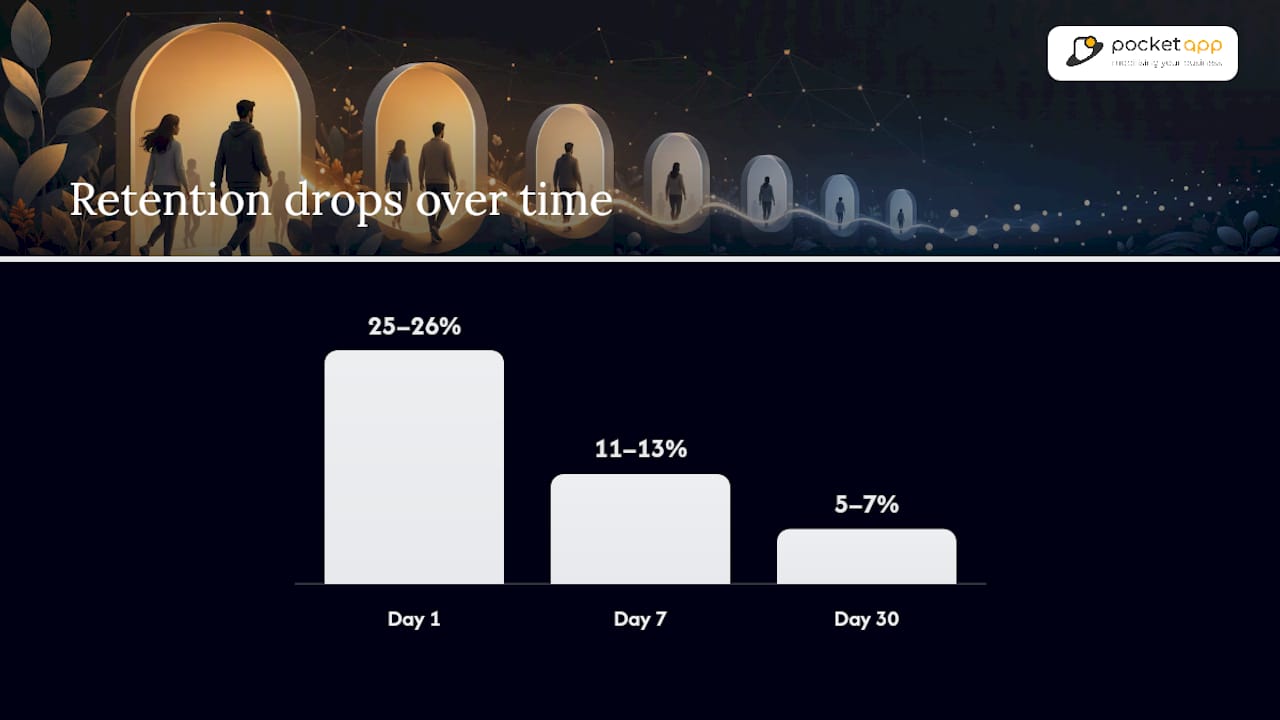
Cross-industry medians in 2026 sit near 25 to 26% for Day 1, 11 to 13% for Day 7, and 5 to 7% for Day 30, based on aggregated data from UXCam. Before you judge your own numbers against these, check one thing first: your category, business model, and platform mix, because a fintech app and a hyper-casual game are not playing the same game.
- Cross-industry median: D1 ≈ 25–26%, D7 ≈ 11–13%, D30 ≈ 5–7%
- Top quartile: D1 ≈ 30%+, D7 ≈ 15%+, D30 ≈ 8%+
- First move: identify your peer category and business model before comparing anything else
Pro Tip: If you only check one cohort this week, check D7. It's the clearest early signal of whether people are forming a habit, and it's far more diagnostic than a single D1 or D30 snapshot.
Key Takeaways
Retention benchmarks only become useful once matched to the right category, platform, business model, and calculation formula.
| Point | Details |
|---|---|
| Know the medians | Cross-industry medians sit near D1 25–26%, D7 11–13%, D30 5–7%, with top quartile above 30/15/8%. |
| Match your peer set | Compare against category, platform, and business model together, never a blended global average. |
| Fix formulas first | Classic N-day, rolling, and range retention produce different numbers from identical data. |
| Diagnose by checkpoint | D1 points to onboarding, D7 to habit formation, D30 to value or monetisation fit. |
| Segment before judging | Split by OS, acquisition channel, geography, and cohort date before drawing conclusions. |
| Get expert diagnosis | Pocketapp's discovery workshops turn raw retention data into a prioritised improvement roadmap. |
Table of Contents
- App retention benchmarks at a glance
- App retention statistics by industry
- How to calculate retention correctly
- Platform and segmentation effects you can't ignore
- Turning benchmarks into targets, not just comparisons
- Best practices for app retention improvement
- Where these numbers come from, and their limits
- Benchmarking by cohort, platform, and usage frequency
- What most retention reports get wrong
- Get help reading your own retention numbers
- Sources
- FAQ
App retention benchmarks at a glance
The table below gives you a fast reference point. These are directional medians, not universal laws, and different vendors calculate them slightly differently.
| Segment | Day 1 | Day 7 | Day 30 |
|---|---|---|---|
| Cross-industry median | 25–26% | 11–13% | 5–7% |
| Top quartile | 30%+ | 15%+ | 8%+ |
| Bottom quartile | Under 20% | Under 8% | Under 3% |
These figures draw on aggregated public data from UXCam, Adjust, and Sensor Tower, alongside cross-platform aggregates from Business of Apps.
Here is the catch: some studies calculate D7 as "active exactly on day 7" (classic N-day), others as "active any time in days 1 through 7" (range retention). The two produce noticeably different numbers from identical raw data, so treat any published benchmark as a rough compass rather than a precise ruler.
App retention statistics by industry
Category shapes everything about your realistic targets. A social app lives and dies on network effects; a fintech app lives on transactional necessity. Here's how the bands typically split:
- Social and messaging: D1 ≈ 30–35%, D7 ≈ 15–20%, D30 ≈ 8–12%. Network effects and daily habit loops push these apps well above the cross-industry median.
- Fintech: D1 ≈ 25–30%, D7 ≈ 15–18%, D30 ≈ 10–14%. Money management creates recurring necessity, which sustains retention even without daily engagement hooks.
- Ecommerce and marketplaces: D1 ≈ 20–25%, D7 ≈ 8–10%, D30 ≈ 3–5%. Purchase cycles are naturally episodic, so D30 dips lower unless loyalty programmes intervene.
- Gaming: Wildly bimodal. Hyper-casual titles often crash to under 10% by D7 and into low single digits by D30, while midcore and strategy games can hold 10 to 15% at D30. Sensor Tower data on top-25 midcore titles shows some retaining a low single-digit percentage even at D365.
- Productivity and utilities: D1 ≈ 20–25%, D7 ≈ 10–12%, D30 ≈ 6–9%. Retention tracks closely with how embedded the tool becomes in a daily workflow.
- OTT and subscription streaming: Billing cycles create sawtooth retention curves, with spikes around renewal dates rather than smooth decay.
Subscription and freemium models generally outperform pure ad-supported apps at D30 within the same category, sometimes by a wide margin, which matters more than the category label alone.
How to calculate retention correctly
Retention numbers are only comparable when the formula matches. Three approaches dominate:
- Classic N-day (strict): the percentage of a cohort active on exactly day N, no more, no less. If 1,000 users install on Monday and 70 open the app on the following Monday (day 7), your D7 retention is 7%.
- Rolling or unbounded retention: counts a user as retained if they return on day N or any day after. This produces higher, more forgiving numbers than strict N-day.
- Range or bracket retention: counts activity any time within a window (for example, days 1 through 7 combined), smoothing out single-day noise but blurring the exact drop-off point.
The formula is simple: retained users on day N ÷ original cohort size × 100. But as Amplitude points out, you also need to fix what counts as "active" (a session open, a key event, a purchase) before the number means anything. Mismatched formulas are the single biggest reason two "identical" retention reports disagree.
Platform and segmentation effects you can't ignore
Raw benchmarks hide a lot. iOS apps typically post higher D30 retention than Android, with one aggregated late-2025 study putting iOS D30 around 4.1% against Android's 2.6% in the same dataset, a gap that widens through the month according to Appcues. Statista tracks similar splits over time. This isn't platform magic. It reflects device tier, income skew, and app store discovery differences between the two audiences.
Before comparing your numbers to any benchmark, segment by:
- Acquisition channel (organic vs paid, and which network)
- Country or region
- Cohort install date (seasonality distorts single-month snapshots)
- Device tier and OS version
- Paid vs organic traffic mix
Turning benchmarks into targets, not just comparisons
A benchmark is only useful once it becomes a diagnostic question. Here's a workable sequence for product teams:
- Define your peer set precisely: category, platform, business model, and primary acquisition channel.
- Pull your own D1, D7, and D30 figures using a matched formula, not whichever your analytics tool defaults to.
- Compare against median first, then top quartile, to set a realistic six-month goal rather than an aspirational one.
- Diagnose the specific failure point rather than treating "low retention" as one problem.
The diagnostic logic is straightforward once you separate the checkpoints:
- D1 failure usually points to onboarding friction: confusing first-run experience, permission requests too early, or a value proposition that isn't obvious in the first two minutes.
- D7 failure usually means the habit loop hasn't formed. Users tried the app once but found no reason to return.
- D30 failure typically signals a value or monetisation mismatch: the app works, but it isn't valuable enough, often enough, to justify a permanent place on the home screen.
This mirrors UXCam's framing of retention as a systems metric rather than a single score, and it's worth internalising before you run any experiment.
Best practices for app retention improvement
A handful of levers move retention more reliably than the rest, and they're worth prioritising in roughly this order:
- Cut time-to-value below 60 seconds. The faster a user experiences the core benefit, the less likely they abandon during onboarding. This is the single highest-leverage D1 fix in most apps.
- Push notification opt-in strategically. Apps that time the permission request after demonstrating value, rather than on first launch, see meaningfully stronger retention, with some studies citing roughly double the retention among opted-in users versus those who decline.
- Gate activation around one meaningful action, not a checklist. Users who complete a single core action (send a message, save an item, log a transaction) return at far higher rates than those who merely browse.
- Personalise onboarding by user intent, asking one or two questions upfront to route people to relevant content rather than a generic tour.
- Fix stability and performance issues before adding features. Crash rates and slow load times quietly erode D7 and D30 numbers in ways acquisition spend can never fix.
Pro Tip: Cluster your one to three star app store reviews by theme before you build anything new. Practitioner guidance from Pushwoosh consistently finds the biggest retention leak sitting in a single recurring complaint, and fixing that one thing often beats a quarter's worth of feature work. A step-by-step guide to improving app UX covers how to translate onboarding friction into concrete design fixes.
Where these numbers come from, and their limits
Published benchmarks vary because the inputs vary. Sample size, market coverage, the active-user definition, and whether a study uses classic, rolling, or range retention all shift the reported figures, sometimes by several percentage points on the same underlying data.
- Update cadence matters: apps that ship frequent releases tend to show smoother D30 curves, because stale builds accelerate churn among lapsed users.
- Business model changes the ceiling: subscription apps often retain multiple times better than ad-supported apps at D30 within the same category, according to Adjust.
- Vendor dashboards (Adjust, Mixpanel, Amplitude, UXCam) each default to slightly different formulas, so a number pulled straight from one tool may not match another without adjustment.
Comparing your app against a single global average is close to meaningless. The only fair comparison is against direct category peers using the same retention formula and the same active-user definition, a point UXCam's own benchmarking guidance makes explicitly.
Reconciling conflicting studies usually means checking the formula first, the sample second, and the market coverage third, in that order.
Benchmarking by cohort, platform, and usage frequency
Segmentation is where most retention analysis goes wrong. Teams pull one blended number, compare it to a published median, and draw the wrong conclusion because the blend hides more than it reveals.
Start with cohort segmentation. Group users by install week or install month rather than looking at a rolling all-time average, because seasonal acquisition spikes (a Christmas campaign, a app store feature) skew the blended figure and mask genuine trend direction. A cohort from a paid UA push in November behaves differently from one acquired organically in February, even within the same app.

Layer platform next. Given the iOS retention premium documented across multiple studies, blending iOS and Android cohorts into one number understates how well your Android experience is actually performing, or overstates iOS. Split them.
Geography matters more than most teams assume. Markets with lower average device tiers or slower connectivity often show lower D7 retention purely from performance friction rather than product weakness. If you operate across regions, benchmark each separately before drawing conclusions about product-market fit.
Finally, segment by frequency of use. A daily-habit app (messaging, fitness tracking) needs a completely different lens from a low-frequency utility (tax filing, travel booking), where a 30-day gap between sessions might be entirely expected rather than a churn signal. Mobile app analytics practices built around event-level cohort tracking make this kind of layered comparison far more reliable than a single dashboard metric. The recommended approach: never compare a blended number to a benchmark. Always compare matched slices.
What most retention reports get wrong
Working alongside product teams that obsess over these numbers, one thing stands out: most retention reports treat a low D30 figure as a verdict, when it is really a starting question. Pocket App has built over 300 mobile projects, and the pattern repeats: teams fix the wrong stage because they read one aggregate number instead of splitting D1, D7, and D30 into separate diagnostic conversations.
Get help reading your own retention numbers
Benchmarks tell you where you stand. They don't tell you why, and that's usually the harder question. Pocketapp runs discovery workshops that pair retention diagnostics with practical UX and engineering fixes, so you leave with a prioritised roadmap rather than another spreadsheet of percentages to interpret alone.
If your D1 numbers are soft, the fix is often onboarding flow and first-run friction rather than a marketing problem, and reducing churn through smarter onboarding is usually the fastest place to start. If D7 or D30 are the weak points, that tends to point toward deeper product and engagement questions, which is where a structured mobile app development engagement earns its keep, combining strategic discovery with the build work needed to fix what the data reveals. Get in touch with Pocketapp to scope a benchmarking review and a short retention roadmap for your app.
Sources
- Mobile app retention benchmarks (UXCam)
- App retention is hard — here’s how to improve it (Appcues blog)
- iOS and Android app user retention rate (Statista)
- What makes a good retention rate? (Adjust)
FAQ
What is a good app retention rate?
A good rate depends on category and platform, but clearing the top quartile (roughly D1 30%, D7 15%, D30 8%) puts you ahead of most published benchmarks from UXCam.
Is 96% retention good?
A 96% retention figure almost always reflects a very short window (such as one day for a low-frequency utility) or a narrow, highly engaged cohort, not a standard D30 figure, since even top-quartile D30 rates sit closer to 8%.
What is D1, D7, and D30 retention?
D1, D7, and D30 measure the percentage of users still active 1, 7, and 30 days after installing, and D30 is the standard checkpoint for cross-app comparison because it captures durable habit rather than initial curiosity.
Is a 90% retention rate good?
A 90% rate is exceptional for any standard D7 or D30 measure and would place an app far above the cross-industry median; it typically only appears in D1 figures for apps with an unusually strong first-session hook or in niche, highly committed user bases.
How do I benchmark my app against the right peers?
Segment by category, platform, business model, and acquisition channel before comparing to any published figure, since a blended or global average, as Mixpanel notes, tends to mislead more than it informs.