
The best in-app messaging strategy is behaviourally triggered: messages fire off real user actions, follow a one message, one ask rule, and sit behind strict frequency caps that respect session momentum. Everything else, format, copy, timing, exists to support that core discipline.
Audit any existing campaign against three lines:
- Trigger logic — does the message fire because the user did something, or because a clock ran out?
- Message priority — if two messages qualify at once, does a queue decide which one wins, or do both fire?
- Frequency caps — is there a hard limit per user, per session, per week?
If you answered "no" to any of those, your next move is simple: replace one session-wide promotional blast with a single behaviour-triggered modal, capped at one show per user, and measure what happens to conversion and dismiss rate before you touch anything else.
Key Takeaways
The most effective in-app messaging strategy pairs behaviourally triggered messages with strict frequency caps and a one message, one ask rule, measured against retention rather than clicks alone.
| Point | Details |
|---|---|
| Trigger from behaviour | Fire messages from real user actions, not arbitrary timers, to keep them relevant and reduce dismiss rates. |
| Enforce one message, one ask | Give every message a single clear action and resolve conflicts with a priority queue, not simultaneous firing. |
| Match format to job | Reserve interstitials for critical asks and use tooltips or banners for lower-stakes, earned moments. |
| Measure the right metric per use case | Judge onboarding on activation lift, upsells on conversion per impression, and retention nudges on D7/D30 lift. |
| Bring in specialist support when scaling | Pocketapp offers discovery, event mapping, template design, and post-launch optimisation for teams outgrowing in-house capacity. |
Table of Contents
- What is an in-app messaging strategy and how does it differ from push?
- Why in-app messaging works and where it delivers the most value
- What are the main in-app message formats and templates?
- How do you build a repeatable in-app messaging strategy framework?
- What copy and UX rules make in-app messages convert?
- What should you measure to prove in-app messaging works?
- Should you build in-app messaging with a vendor SDK or in-house?
- When should you hire help instead of building in-house?
- Sources
- FAQ
What is an in-app messaging strategy and how does it differ from push?
An in-app messaging strategy is the set of rules that decide when, why, and how a product shows messages, banners, tooltips, or modals, while a user is actively inside the app. Push notifications, by contrast, reach people who have already left. That distinction shapes almost everything else about how you should plan campaigns.
Operationally, in-app messaging works through a small set of mechanics:
- Trigger types: behavioural (completed a step, hit a usage limit), lifecycle (day 3, day 30), or contextual (viewing a specific screen).
- Rendering surfaces: modals, banners, tooltips, slideouts, or inline panels rendered by the app's own client.
- Control layer: unlike push, which relies on OS-level delivery and opt-in permissions, in-app messages are fully within your control the moment a session starts.
Helpshift's comparison of the two channels puts it plainly: push targets lapsed users outside the app while in-app messages influence behaviour during an active session, and the two are complementary rather than competing.
| Dimension | Push notifications | In-app messaging |
|---|---|---|
| Reach | Works even when app is closed | Only reaches active sessions |
| Timing control | OS and user permission dependent | Fully controlled by the app |
| Opt-in requirement | Explicit permission needed | No separate permission needed |
| Primary job | Reactivation, bringing users back | Guiding behaviour in the moment |
| Measurement focus | Incremental sessions, open rate | Action per impression, retention lift |
Why in-app messaging works and where it delivers the most value
Context is the whole advantage. A message shown to someone already using your product lands differently than one competing for attention on a lock screen. In-app messages typically show view rates near 75%, against push open rates of roughly 5–15%, and the same research links well-implemented in-app programmes to retention gains of around 30%.
That gap matters most in specific moments, not everywhere at once:
- Onboarding: guiding a new user through the first meaningful action.
- Feature adoption: surfacing a feature the user hasn't discovered but would benefit from.
- Paywalls and upsell: presenting a plan upgrade exactly when a limit is hit.
- Cart or task recovery: nudging someone back to an abandoned flow within the same session.
- Guidance and tooltips: reducing confusion at points of friction.
- In-product surveys: capturing feedback while the experience is fresh.
Each use case needs its own success metric, not a blanket "engagement" score. Onboarding messages should be judged on activation lift. Upsell messages need conversion per impression, not just clicks. Retention-focused nudges only prove themselves over a longer horizon, watch the D7 and D30 delta, not the immediate tap rate. Treating every message as though it serves the same goal is how teams end up optimising for the wrong number.
What are the main in-app message formats and templates?
Choosing the right surface is a design decision as much as a strategic one. The format has to match the weight of the ask.
- Full-screen interstitials: reserved for critical moments, permission requests, mandatory updates, or a paywall the user must engage with.
- Centre modals: strong for a single, focused ask, such as a feature announcement or a survey prompt.
- Top or bottom banners: lower-friction, good for informational nudges that don't need to interrupt the task.
- Slide-ins: useful for time-sensitive but non-blocking messages, like a limited offer.
- Tooltips and coachmarks: ideal for progressive disclosure, pointing at a specific UI element without hijacking the screen.
- Inline or embedded panels: work well when the message is part of the content flow, such as a recommendation card.
- Surveys: best kept short and placed after a task completes, not mid-flow.
An interstitial makes sense for a critical permission request or a hard paywall. A tooltip makes sense when you're introducing a feature the user can safely ignore for now. Mismatching the two, interrupting a task with a full-screen takeover for something minor, is one of the fastest ways to spike dismiss rates.
A few placement rules protect the experience regardless of format: keep the message physically close to the UI element it references, always offer an obvious dismiss action, and never punish a back or close tap with a repeat prompt seconds later. Rocket shows how welcome messages, feature tooltips, and short surveys map cleanly onto these formats when teams keep the job of each message narrow.
How do you build a repeatable in-app messaging strategy framework?
Two lenses do most of the heavy lifting once you move past individual campaigns: earned versus interruptive, and one message, one ask.
Earned vs interruptive asks whether the user invited this message through their own behaviour, completing a step, hitting a limit, opening a specific screen, or whether you're interrupting an unrelated task to push something at them. Earned messages can afford to be more assertive in format. Interruptive ones need a lighter touch, a banner rather than an interstitial, because you're spending trust the user didn't offer.
One message, one ask is the discipline that prevents your best campaign from cannibalising itself. Every message should carry a single, clear action. When two campaigns qualify to fire in the same session, and they eventually will, a priority queue needs to decide which one wins, not both. Segment8's framework for guiding users without being annoying recommends a single messaging calendar and explicit approval rules precisely to stop this kind of collision before it reaches the user.
Lifecycle stage should determine both the trigger and the surface:
| Lifecycle stage | Example trigger | Recommended surface |
|---|---|---|
| New user | Completes account setup | Tooltip or short modal |
| Active user | Uses a feature repeatedly | Inline recommendation or banner |
| Power user | Hits a usage ceiling | Upsell modal or interstitial |
| Dormant user | Returns after inactivity | Welcome-back banner |
Segmentation should stay tight before you build any campaign. Confirm the audience by lifecycle stage, by behaviour (not just demographics), by prior message exposure (to avoid repeat fatigue), and by platform or locale where the experience genuinely differs. SaaSquatch's playbook on in-app messaging strategy makes the case for prioritising activation messages over general announcements for new users specifically because the lifecycle stage changes what "relevant" means.
What copy and UX rules make in-app messages convert?
Copy in a modal has to earn its place in seconds, not paragraphs. Lead with the benefit, keep it scannable, and give the user exactly one clear next step.
Weak: "We've made some exciting updates to help you get more out of your experience. Check them out now!" Strong: "Your export limit resets in 3 days. Upgrade now to export without waiting."
The second version states a fact, states the benefit, and gives one action. That's the whole formula.
A short list of do's and don'ts keeps teams from drifting back into marketing-speak:
- Do trigger from real behaviour, not arbitrary timers. InsiderOne's research on in-app messaging best practices found that triggers tied to actions like hitting a usage limit consistently outperform time-based blasts.
- Do write for scanning, not reading, most users decide to dismiss or engage within two seconds.
- Don't use internal jargon or feature names the user hasn't learned yet.
- Don't stack multiple asks in one message; that's what the priority queue is for.
- Do respect progressive disclosure: reveal complexity only once the user has shown they need it.
Accessibility and localisation deserve the same rigour as copy. Touch targets need to meet minimum size guidelines so a dismiss button isn't a mis-tap away from an accidental action. Contrast ratios matter for anyone reading in bright sunlight or with low vision, and screen reader labels need to describe the message's purpose, not just "close button". Time-sensitive messages should respect the user's actual timezone, not the server's, and copy needs proper localisation rather than a machine translation bolted on at launch. Pocketapp's guide to app design tips for engagement covers touch target sizing and contrast in more depth if you're building your design system from scratch.
Pro Tip: Read every message draft aloud before it ships. If it sounds like an advert, rewrite it. Vmobify's research on product-like versus marketing-like messaging found that messages which feel like part of the product protect flow, while anything that reads as marketing trains users to dismiss on reflex.
What should you measure to prove in-app messaging works?
Vanity metrics are the trap here. A high open rate means nothing if it doesn't move a downstream number you actually care about.
- Impression or view rate — how many eligible users actually saw the message.
- Interaction rate — the share who engaged with the message at all, tap, swipe, or scroll.
- Click-through rate (CTR) — the share who took the primary action.
- Conversion per impression — the metric that matters most for revenue-driving messages like upsells.
- Dismiss rate — a leading indicator of message fatigue or poor targeting.
- Retention lift at D7 and D30 — whether the message changed behaviour beyond the immediate session.
- LTV delta — the longer-term commercial signal, where the data allows you to track it.
Test in a fixed order: triggers first, then format, then copy. Changing all three at once tells you nothing about which one moved the number. Always hold back a control group that sees no message, or an unrelated placeholder, so you can attribute lift honestly rather than assuming correlation. SaaSquatch's guidance on lifecycle-based testing specifically recommends holdout experiments to isolate retention lift from natural product usage.
Attribution has to match the channel's actual job. Measuring in-app messaging on incremental sessions, a push metric, will always disappoint, because that was never its function. Judge in-app on action-per-impression and the retention lift that follows; judge push on whether it brought someone back at all. Pocketapp's guide to mobile app analytics is a useful reference if your team hasn't formalised event instrumentation yet.
Should you build in-app messaging with a vendor SDK or in-house?
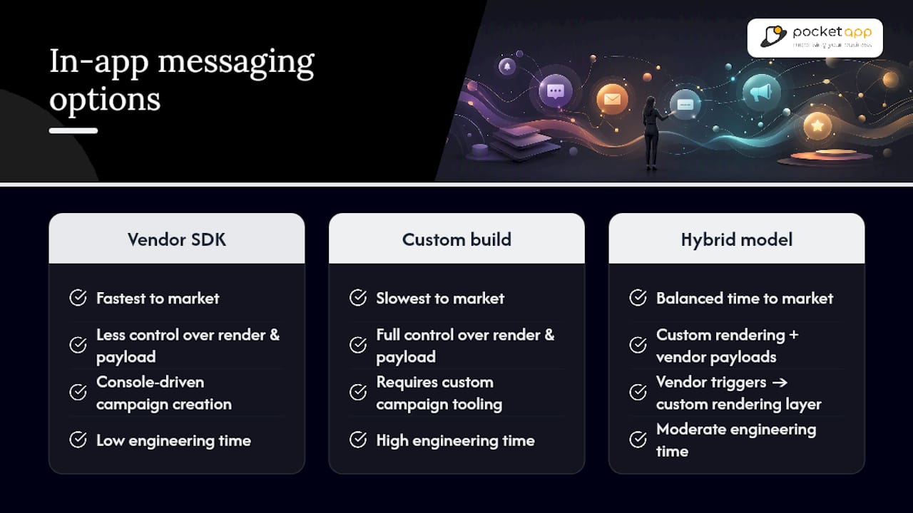
Three implementation paths cover most teams: a vendor SDK, a fully custom system, or a hybrid of both. RapidNative's guide for product teams frames the trade-off clearly: vendor SDKs get you to market fastest and hand you console-driven campaign creation, but you sacrifice some control over render fidelity and payload structure. Custom builds give you full control of both, at the cost of engineering time. Hybrid models, vendor triggers feeding a custom rendering layer, often land closest to the sweet spot for teams with a strong design system to protect.
The data flow behind any of these options follows roughly the same shape: user event → trigger engine → delivery surface → analytics pipeline. Frequency caps and suppression logic belong at the trigger engine layer, before a message ever reaches the delivery surface, not as an afterthought bolted onto the UI. Get that sequencing wrong and you'll ship a technically correct message that fires twice because two systems didn't share suppression state.
Privacy needs the same discipline as the trigger logic itself. Keep only the event data genuinely required to power a trigger, not everything your SDK is capable of capturing. Respect consent choices across channels; if a user has opted out of marketing communication generally, that preference should inform in-app messaging sequencing too, not just email and push. As task-specific AI features become more common in enterprise software, Gartner's forecast puts 40% of enterprise apps featuring these agents by 2026, which means trigger engines will increasingly need to account for AI-initiated in-app guidance alongside rule-based campaigns.
When should you hire help instead of building in-house?
A few signals reliably point towards bringing in a specialist rather than building this internally from scratch:
- You need to scale a messaging programme quickly across multiple platforms at once.
- Your integration needs span several analytics tools or a CDP that your internal team hasn't wired together before.
- Your design system has strict brand fidelity requirements that off-the-shelf SDK rendering can't match.
- Engineering capacity is already committed to core product work, not messaging infrastructure.
- Lifecycle orchestration has grown complex enough that trigger conflicts are becoming a real problem.
A solid delivery partner should walk through discovery, mapping the analytics events that will drive triggers, designing the render templates, testing across a representative device set, and defining a rollback plan before anything goes live. Governance rules and a proper handover, documentation your team can actually maintain, are what separate a project that lasts from one that quietly breaks six months later.
Pro Tip: Ask any prospective partner how they handle frequency-cap conflicts across two campaigns launching in the same sprint. Their answer tells you more about their process than their portfolio does.
An author's practical viewpoint on balancing growth and product health
Growth teams love in-app messaging because it converts well, and that's exactly the risk. The temptation is to keep adding messages until the calendar is full, and by then the product feels like it's constantly asking for something. My rule of thumb: if dismiss rate rises and retention falls in the same window, pause the programme immediately, don't wait for the next planning cycle to reconsider it.
How Pocketapp helps you ship in-app messaging that actually holds up
Getting the trigger logic, priority queue, and frequency caps right across multiple platforms is genuinely difficult to do well without dedicated engineering attention, and that's where a lot of internal projects stall halfway through. Pocketapp runs discovery workshops to map the exact analytics events your triggers should fire from, then designs the UI templates, builds and QA-tests across real devices, and stays on for post-launch optimisation once the data starts coming in.
A typical engagement starts with a discovery phase to define message jobs and priority rules, moves into template design and event mapping, then into an agile build cycle with device QA before launch, followed by ongoing analytics support to refine triggers against real user behaviour. If your team is weighing whether to build this in-house or bring in a partner who has already solved the trigger-conflict and frequency-cap problems before, get in touch through Pocketapp's mobile app development service page to talk through what a production-ready messaging programme would look like for your app.
Sources
- Push notifications vs in-app messaging: what's the difference? — Helpshift
- In-App Messaging vs Push: When Each Wins
- In-app messaging strategy (SaaSquatch)
- In App Messaging: A Practical Guide for Product Teams | RapidNative
- In-App Messaging: Benefits, Best Practices & Strategies — InsiderOne
FAQ
What is an example of an in-app messaging strategy?
A common example is a behaviourally triggered modal that appears only after a user hits a specific usage limit, offering one clear upgrade action, capped at one appearance per user to avoid repeat fatigue.
What does "in-app messaging" mean?
In-app messaging refers to messages, banners, tooltips, or modals shown to a user while they're actively inside an app, as distinct from push notifications, which reach people outside the app entirely.
Can you provide an example of an in-app message?
A tooltip pointing at a newly unlocked feature the first time a user reaches the relevant screen is a typical example, paired with a short one-line benefit and a dismiss option.
How do I get started with in-app messaging?
Start by mapping the user actions you want to trigger from, choosing one message format per job, and setting a frequency cap before launch; teams without in-house capacity often bring in a specialist like Pocketapp for the initial app design and event-mapping work.
Recommended
- Pocket App | Pocket App CEO Paul Swaddle talks about mobile users neglecting text message in favour of a modern and shiny App
- Push notification strategy: a 2026 guide for marketers
- Pocket App | How to Keep Users Engaged with Your App
- Pocket App | Leveraging User Feedback for Iterative Mobile App Design