
Yes, WCAG applies to mobile apps, including native, hybrid and mobile web builds, and WCAG 2.2 sets the current benchmark. The W3C's WCAG2Mobile guidance maps existing success criteria onto mobile contexts and adds new ones written specifically for touchscreens and small displays. If you're building or auditing a mobile app right now, six criteria matter more than the rest: target size, dragging movements, focus not obscured, accessible authentication, redundant entry and consistent help.
The scale of what's at stake is worth stating plainly. Statista's tracking of global mobile users shows billions of people now depend on smartphones as their primary computing device, which means an inaccessible app doesn't just fail a compliance test. It locks out a meaningful share of its own potential user base.
Three actions will move you forward this sprint:
- Set your target level to WCAG 2.2 AA. This is the level most legal frameworks and procurement contracts reference, and it's achievable without redesigning your whole product.
- Add a mobile accessibility checklist to sprint acceptance criteria. Don't treat accessibility as a separate audit at the end. Build it into "done".
- Run VoiceOver and TalkBack checks on your current build today. You'll likely find focus order problems and mislabelled controls within the first ten minutes.
Key Takeaways
WCAG 2.2 applies fully to native, hybrid and mobile web apps, and meeting it requires prioritising target size, dragging alternatives, unobscured focus, accessible authentication and layered testing across automated tools, platform screen readers and real assistive-technology users.
| Point | Details |
|---|---|
| WCAG 2.2 covers mobile | WCAG2Mobile maps existing success criteria to touchscreens and adds mobile-specific ones like target size and dragging movements. |
| Prioritise five criteria | Target size, dragging movements, focus not obscured, accessible authentication and consistent help catch most mobile failures. |
| Layer your testing | Combine automated tools, VoiceOver/TalkBack checks, manual exploratory testing and real assistive-technology user sessions. |
| UK public-sector apps face legal duties | GOV.UK actively monitors public-sector mobile apps under the 2018 Accessibility Regulations. |
| Build it into sprints, not audits | Accessibility acceptance criteria belong in user stories from discovery onward, not a pre-launch checklist. |
Table of Contents
- What does W3C guidance say about WCAG mobile apps?
- Which WCAG 2.2 success criteria matter most for mobile apps?
- What should a mobile accessibility checklist for developers include?
- How do you test mobile apps for WCAG accessibility?
- How does UK monitoring and regulation apply to mobile app accessibility?
- How do you build accessibility into the mobile app development lifecycle?
- Ready to build a WCAG-compliant mobile app?
- What professional teams get wrong about mobile accessibility
- Sources
- FAQ
What does W3C guidance say about WCAG mobile apps?
The Guidance on Applying WCAG 2.2 to Mobile Applications, commonly known as WCAG2Mobile, does one specific job: it takes the existing WCAG 2.2 success criteria and explains how each one applies when the interface is a phone or tablet screen rather than a desktop browser window. It's a companion document, not a replacement standard.
That distinction matters for how you use it. WCAG2Mobile is informative, not normative. It doesn't create new legal obligations or a separate rulebook you need to satisfy alongside WCAG 2.2. Instead, it clarifies how the same Level A and AA success criteria you'd apply to a website should be interpreted when your interface has a touchscreen, a five-inch display, and gestures instead of a mouse pointer. If your app already meets WCAG 2.2 AA in spirit, WCAG2Mobile tells you what "meeting it" looks like in practice on a handset.
Scope is narrower than some teams assume. WCAG2Mobile covers phones and tablets specifically, and it addresses native apps, hybrid apps and mobile web content alike. It doesn't extend into wearables, in-car systems or smart TV interfaces, though many of the same principles transfer reasonably well.
W3C's own Mobile Accessibility page frames this as an extension of core web accessibility rather than a parallel discipline. The underlying user needs, being able to perceive content, operate controls, understand what's happening and rely on robust technical implementation, don't change between a laptop and a phone. What changes is the toolkit: touchscreens replace pointer and keyboard input, screens shrink dramatically, and input modalities multiply to include voice, gesture and device orientation.
Teams working through WCAG2Mobile for the first time will encounter a short glossary of terms worth adopting early, because they recur throughout the guidance and shape how you write test cases:
- Screen refers to what's visible to the user at a single point in time, roughly equivalent to a "page" in web terms but often more transient.
- View describes a particular state or arrangement of content within a screen, such as a filtered list or an expanded card.
- Set of screens covers a related sequence, like the steps in a checkout flow or an onboarding wizard.
- User interface component is any interactive part of the app, a button, toggle, slider or input field, and it's the unit most success criteria actually test against.
Adopting this vocabulary inside your team pays off quickly. Bug reports that say "the focus indicator disappears on view three of the checkout set of screens" are far more actionable than "focus is broken somewhere in checkout". Pocketapp's own work on designing accessible mobile apps leans on this same terminology precisely because it forces design and engineering teams to describe problems at the same level of granularity, rather than talking past each other in review meetings.
One more scoping point worth flagging: WCAG2Mobile assumes you're already broadly familiar with WCAG 2.2's four principles, perceivable, operable, understandable and robust. It doesn't re-explain them from scratch. If your team needs that grounding first, it's worth reviewing how those principles apply to app accessibility before diving into the mobile-specific criteria below.
Which WCAG 2.2 success criteria matter most for mobile apps?
WCAG 2.2 didn't just add mobile considerations as an afterthought. Several success criteria were written specifically because touchscreen interaction patterns exposed gaps that desktop-focused WCAG 2.1 simply didn't cover. Here's what to prioritise, in the order most mobile audits flag them.
-
Target size (2.5.8). Interactive elements need a minimum target area, and WCAG 2.2 sets the AA minimum at 24 by 24 CSS pixels, with limited exceptions for inline text links and cases where the target sits within a larger accessible spacing arrangement. The common failure is a set of icon buttons packed edge to edge in a toolbar, each rendering at 18 pixels because that's what fit the design mock. Fix it by auditing actual rendered hit areas across device densities, not just the design file, and adding invisible padding around small icons rather than shrinking the tap target to match the visual icon.
-
Dragging movements (2.5.7). Any function achieved through a drag gesture, reordering a list, adjusting a slider, swiping to delete, must also be achievable through a single-pointer action without dragging. A common mobile failure is a settings screen where volume or brightness can only be adjusted by dragging a slider thumb, with no tap-to-set or stepper alternative. The fix is usually straightforward: add increment and decrement buttons alongside the slider, or make the slider track itself tappable to jump to a value.
-
Focus not obscured (2.4.11). When a user tabs or swipes to a focused element, that element must not be completely hidden behind another part of the interface, most often a sticky header, a bottom navigation bar, or the virtual keyboard. This one catches teams out constantly on forms: a user focuses an input field near the bottom of the screen, the keyboard slides up, and the field they're typing into is now covered. Test this specifically by tabbing through every form with the keyboard open, not just with it dismissed.
-
Accessible authentication (3.3.8) and redundant entry (3.3.7). These two travel together in practice. Accessible authentication means you can't force a cognitive function test, remembering a password, solving a puzzle, transcribing a code, as the only way to log in, without an alternative that doesn't rely on that same cognitive step (password managers, biometrics, or copy-paste support all count). Redundant entry means you shouldn't ask users to re-enter information the app already collected earlier in the same process. A frequent mobile violation is a checkout flow that makes users retype their address for billing after already entering it for delivery, or a login screen that blocks pasting into a password field.
-
Consistent help (3.2.6). If your app offers help mechanisms, a support chat button, a contact link, a help centre, they need to appear in the same relative location across every screen where they're present. Scattering "Help" links between a hamburger menu on some screens and a floating action button on others fails this criterion, even if help is technically always available.
Pro Tip: Run a "keyboard-open audit" once per sprint: open every form screen in your app with the on-screen keyboard visible, then check whether the focused field, any error messages, and the submit button all remain visible and reachable. This single fifteen-minute exercise catches more focus-obscuring bugs than most formal accessibility reviews.
None of these five criteria require a redesign. They require deliberate attention at the point where a designer places a button or a developer wires up a gesture, which is exactly why baking them into acceptance criteria works better than bolting on an audit at the end.
What should a mobile accessibility checklist for developers include?
A checklist earns its place when it's specific enough to catch real bugs, not vague enough to tick without thinking. MDN's mobile accessibility checklist is the most practical developer-facing reference available, and it breaks down cleanly into five areas worth running through on every build.
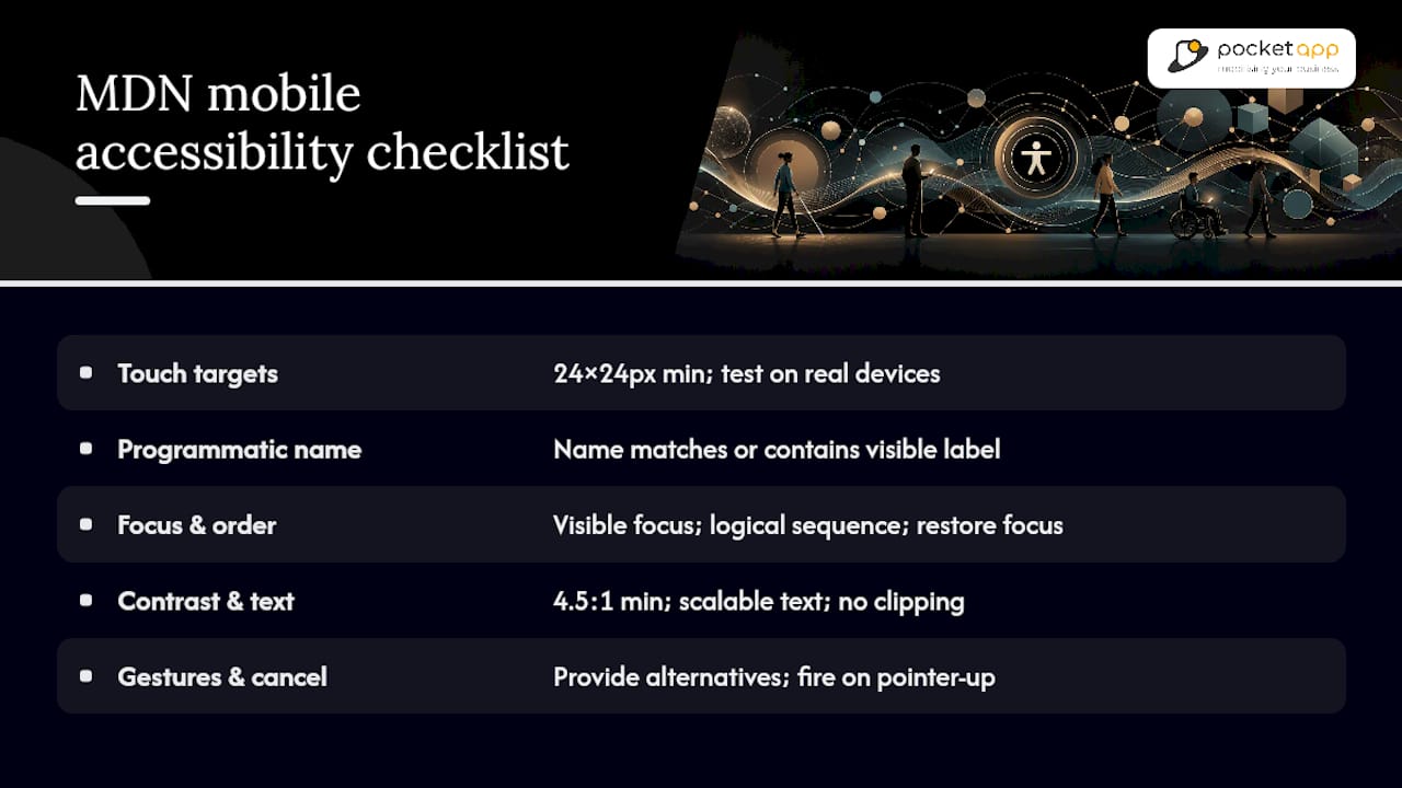
Touch targets and spacing. Beyond the 24 by 24 pixel minimum from WCAG 2.2, test actual devices, not just simulators, because rendered target size varies with screen density and the user's own accessibility settings (larger text and larger touch targets are common iOS and Android preferences that can shrink your effective margins). Leave genuine spacing between adjacent targets, not just visual padding that a screen reader ignores.
Label-in-name and programmatic naming. Every interactive control needs an accessible name that matches or contains its visible label. A button showing "Submit" but exposing "btn_primary_action" to a screen reader breaks this immediately, and it's a startlingly common failure in apps built quickly on cross-platform frameworks where developers forget to set accessibilityLabel or its Android equivalent.
Visible focus and focus order. Focus should move in a logical sequence that matches the visual layout, and the current focus should always be visibly indicated, not just technically present. Dynamic content is where this usually breaks: a modal opens, but focus stays on the button that triggered it, or an overlay closes and focus vanishes into the void instead of returning to a sensible location.
Colour contrast and scalable text. MDN's guidance specifies a minimum contrast ratio of 4.5:1 for normal body text against its background, rising for smaller or thinner text. Test this outdoors in direct sunlight where possible, because a contrast ratio that passes a lab check can still be unreadable on a phone screen in bright daylight. Text also needs to scale with the user's system font size settings without clipping, truncating, or breaking layout.
Gestures and pointer cancellation. Never make an essential function reachable only through a long press or a multi-finger gesture without a simpler alternative. Equally important, and frequently missed, is pointer cancellation: actions should generally fire on pointer-up rather than pointer-down, so a user can move their finger away to cancel an accidental tap before it registers.
Global mobile usage figures underline why these checks are worth the time. With billions of active mobile users worldwide, even a small percentage relying on assistive technology represents a substantial, easily overlooked audience.
Off-screen content and orientation changes round out the checklist. Content hidden visually (a collapsed accordion, a background carousel slide) needs to be genuinely hidden from screen readers too, using proper ARIA or platform-native hidden states, not just opacity: 0 or an off-canvas transform that leaves it discoverable by swipe. When orientation changes from portrait to landscape, announce meaningful layout shifts and confirm that nothing critical becomes unreachable in the new orientation. Pocketapp's inclusive-by-design strategies treat orientation handling as a first-class QA step precisely because it's so easy to test only in one orientation and ship the other broken.
How do you test mobile apps for WCAG accessibility?
No single tool catches everything, which is why the most reliable mobile testing plans layer four distinct approaches rather than leaning on one.
-
Automated tooling first, as a floor, not a finish line. Tools built on engines like axe-core can catch missing labels, contrast failures and some structural issues quickly, and they're excellent for regression testing on every build. But automated checks typically catch only a fraction of real accessibility issues; gesture behaviour, focus order logic and genuine usability with a screen reader all require a human. Guidance from checklists like QAPractices' mobile accessibility resource is consistent on this point: automation supports manual testing, it doesn't replace it.
-
Platform screen reader testing with VoiceOver and TalkBack. These are non-negotiable, because they're what real assistive-technology users actually rely on. On iOS, test with VoiceOver's rotor to check heading navigation and landmark structure, confirm swipe gestures move focus in a sensible order, and listen for whether double-tap activation behaves consistently across custom components. On Android, TalkBack testing should check similar ground: linear swipe navigation, whether custom views expose the right role and state, and whether gesture navigation conflicts with any custom in-app gestures you've built. The most common pitfall on both platforms is custom UI components, sliders, tab bars, card carousels, that were styled from scratch and never had their accessibility roles wired up, so they announce as blank or unlabelled to a screen reader user even though they look and function correctly visually.
-
Manual exploratory testing against written acceptance criteria. Turn each success criterion into a testable sprint statement: "every form field remains visible when the on-screen keyboard is open" or "every icon-only button has a minimum 24 pixel hit area and an accessible name". Testers who exploratively navigate the app using only a keyboard, or only a screen reader, without sighted reference, tend to surface issues that scripted test cases miss entirely.
-
User testing with people who actually use assistive technology. This is the layer most teams skip, usually for budget or time reasons, and it's the layer that catches the problems the other three miss. Recruit a small group of real assistive-technology users, screen reader users, switch control users, users with motor impairments who rely on larger touch targets, and give them realistic tasks rather than a guided tour. Watch where they hesitate, backtrack, or give up, not just whether they eventually complete the task.
Pro Tip: Before a user testing session, resist the urge to explain how a feature "should" work. Give the participant the task, hand them the device, and stay quiet. The moments where they get stuck are worth more than an hour of your own internal QA notes.
Pocketapp's approach to verification and testing treats these four layers as sequential gates within a sprint rather than a single end-of-project audit, which catches problems while they're still cheap to fix.
How does UK monitoring and regulation apply to mobile app accessibility?
If you're building for the UK public sector, or supplying software to organisations that are, mobile accessibility isn't optional guidance. It's an active compliance area with real monitoring behind it.
GOV.UK's accessibility monitoring team has extended its testing programme to public-sector mobile apps, not just websites, and its own account of the process states plainly that these apps carry a legal requirement to meet WCAG standards. Teams that assumed website audits were the only exposure have found their mobile apps tested with the same rigour, using the same success criteria discussed throughout this article.
The legal basis sits in the Public Sector Bodies (Websites and Mobile Applications) Accessibility Regulations 2018, the statutory instrument that extends accessibility obligations explicitly to mobile applications alongside web content. It's worth reading directly if you're working for or with a public body, since it sets out the specific duties, exemptions and enforcement mechanisms rather than leaving them to interpretation.
A practical distinction matters here: guidance versus legal obligation.
- WCAG2Mobile and MDN's checklist are guidance. They tell you how to meet a standard well, but they don't themselves create a legal duty.
- The 2018 Regulations create the legal duty, at least for public-sector bodies and organisations delivering public services digitally.
- Private-sector obligations vary by context and often flow through other legislation, such as equality law, rather than the 2018 Regulations directly.
If your organisation faces genuine legal exposure, procurement risk, a public-sector contract, an equality claim, treat this article and the guidance it draws on as a technical roadmap, not a legal opinion, and get specific legal assurance for your situation. Pocketapp's own summary of the legal and moral case for app accessibility covers this distinction in more depth if you need to brief stakeholders who aren't close to the technical detail.
How do you build accessibility into the mobile app development lifecycle?
Accessibility that survives contact with a real sprint schedule gets built in at discovery, not bolted on before release. At the discovery and prototyping stage, we ask clients directly which assistive technologies their existing users rely on and translate WCAG 2.2's mobile-relevant criteria into specific, testable acceptance criteria attached to individual user stories, rather than a separate accessibility backlog that inevitably gets deprioritised.
A sprint-level checklist keeps this discipline alive once development starts:
- Designers check touch target sizing and colour contrast in the design file before handoff, using the same 24 pixel and 4.5:1 thresholds developers will later test against.
- Developers wire up accessible names, focus order and pointer cancellation as part of building the component, not as a fix-up pass afterwards.
- Testers run a VoiceOver or TalkBack pass on every screen touched that sprint, not just at the end of the release cycle.
- Product owners involve assistive-technology users in testing at key milestones, particularly before major navigation or checkout changes ship.
Pro Tip: Write "tested with VoiceOver/TalkBack" as a literal checkbox on your pull request template. Teams that make accessibility testing a visible, required step in code review catch far more issues than teams that rely on a separate audit weeks later.
Across more than 300 projects spanning retail, healthcare, charity and consumer engagement apps, this lifecycle approach has repeatedly proven cheaper and more durable than late-stage remediation. A checkout flow redesigned after launch to fix accessible authentication failures costs considerably more, in both engineering time and reputational risk, than the same fix made during initial component build. Building accessibility into discovery workshops and sprint acceptance criteria from day one, rather than treating it as a pre-launch checklist item, is the single biggest lever available to product teams.
Ready to build a WCAG-compliant mobile app?
Getting WCAG 2.2 right on mobile takes more than a checklist tacked onto the end of a project. It takes a development partner who treats accessible authentication, target sizing and focus management as core engineering requirements from the very first sprint, not a compliance afterthought bolted on before release.
Pocketapp has spent years building mobile apps for clients across retail, healthcare and charity sectors, where accessibility isn't a nice-to-have but a genuine operational and legal requirement. Our discovery workshops build WCAG 2.2 success criteria into user stories from day one, and our sprint testing includes VoiceOver and TalkBack passes as standard practice, not an optional extra.
If you're planning a new mobile app or need to bring an existing one up to WCAG 2.2 AA, talk to us about your project and we'll show you what an accessibility-first build process actually looks like in practice.
What professional teams get wrong about mobile accessibility
Most teams treat WCAG compliance as a website problem with a mobile appendix, and that's backwards. The mobile-specific criteria in WCAG 2.2, target size, dragging alternatives, accessible authentication, exist precisely because touchscreen interaction broke assumptions baked into earlier web-first guidance. Treating mobile as secondary means you inherit desktop thinking in an environment where it doesn't hold.
The conventional advice, "run an automated scan before release", undersells the problem. Automated tools miss gesture behaviour and real screen reader usability entirely, which is exactly where most mobile failures live. What actually works is unglamorous: acceptance criteria written into user stories, a VoiceOver pass every sprint, and genuine testing with assistive-technology users before major flows ship.
If you take one thing from this, prioritise the keyboard-open focus check and the dragging-alternative audit first. They're cheap to fix, frequently broken, and disproportionately damaging when missed.
Sources
- Guidance on Applying WCAG 2.2 to Mobile Applications (WCAG2Mobile)
- How mobile apps undergo accessibility monitoring
- Legislation
FAQ
Does WCAG cover mobile apps?
Yes. WCAG2Mobile explicitly maps WCAG 2.2 success criteria onto native, hybrid and mobile web apps, covering phones and tablets at Level A and AA.
What are the accessibility requirements for mobile apps?
The core requirements come from WCAG 2.2, with mobile-specific priorities including a minimum 24 by 24 pixel target size, alternatives to drag-only gestures, unobscured focus indicators, and accessible authentication that doesn't force a memory or transcription test.
How can I test the accessibility of mobile apps?
Combine automated tools for regression checks, manual testing with VoiceOver on iOS and TalkBack on Android, exploratory testing against written acceptance criteria, and sessions with real assistive-technology users before major releases.
Is it safe to give accessibility permission to apps?
Accessibility permissions on Android and iOS grant an app deep control needed for screen reading and switch access, so only enable them for apps from trusted, verified sources, and review which apps hold that permission periodically.