
iOS app design is the practice of building a platform-native user interface that respects Apple's Human Interface Guidelines while expressing a distinct product identity. Get it right and your app feels immediately familiar to iPhone users; get it wrong and no amount of visual polish will save the experience.
Three things to do before you open a design file:
- Read Apple's 'Designing for iOS' guidance to understand device characteristics and the patterns users already expect.
- Sketch your core user flows on paper or a whiteboard before touching components. Screens designed in isolation almost always produce navigation debt.
- Set up a platform-accurate artboard using the recommended iPhone 16 baseline size and define your design tokens — colour, spacing, and typography — before placing a single element.
Pro Tip: Reserve the UI layer for navigation controls (tab bars, navigation bars, toolbars) and use the content layer as the canvas for your brand. WWDC26 guidance on brand identity makes this split explicit: familiarity lives in the chrome, distinctiveness lives in the content.
Key takeaways
Following Apple's HIG, designing tokens first, and testing accessibility on real devices are the three practices that most reliably produce iOS apps users trust and return to.
| Point | Details |
|---|---|
| Start with HIG and flows | Read Apple's Designing for iOS guidance and map user flows before opening a design tool. |
| 44×44 pt touch targets | Every interactive element needs a minimum 44×44 pt hit area; annotate this in your handoff spec. |
| Token-first design | Define colour, spacing, and motion tokens before screen design to eliminate handoff inconsistencies. |
| Test accessibility on device | Check contrast ratios, VoiceOver, and Dynamic Type at maximum size on a real iPhone, not just in the simulator. |
| Pocketapp for UK projects | Pocketapp delivers HIG-aligned iOS design and development for UK clients across over 300 completed projects. |
Table of Contents
- What are the core iOS design principles you should follow?
- Which iOS patterns and components should every designer know?
- How do touch targets, thumb zones, and accessibility work together?
- How do you design responsive layouts across iPhone, iPad, and large screens?
- When should you use animation, and how long should it last?
- Which tools and resources should you use to prototype iOS UIs?
- What does a solid testing and handoff process look like?
- How Pocketapp applies these rules on UK client projects
- A practitioner's perspective on iOS design trade-offs
- Pocketapp's iOS design and development services
- Sources
- FAQ
What are the core iOS design principles you should follow?
Apple's Human Interface Guidelines organise every interface decision around three principles: clarity, deference, and depth. These are not abstract values; each one translates directly into layout and interaction rules.
Clarity means the interface never competes with the content. Typography is legible at every size, icons are unambiguous, and negative space is used deliberately rather than filled. In practice, this means limiting the number of controls visible at once and using progressive disclosure to reveal complexity only when the user needs it.
Deference means the UI steps back and lets content lead. Backgrounds are translucent or neutral, not decorative. Large titles appear when a list is at rest and collapse as the user scrolls, keeping attention on the content rather than the chrome.
Depth communicates hierarchy through layers, motion, and shadow rather than through flat colour alone. Cards lift above backgrounds; sheets slide over content. With iOS 26's Liquid Glass design language, bars and toolbars now float above content using a new translucent material — a direct expression of depth that WWDC25 guidance advises designers to accommodate by adopting system views wherever possible.
A practical checklist for applying these principles:
- Limit primary actions on any screen to one or two; secondary actions belong in context menus or action sheets.
- Use system font sizes and Dynamic Type scaling rather than fixed pixel sizes.
- Prefer system components (UITabBar, UINavigationBar, UIButton) over custom controls unless there is a measurable user benefit.
- Apply progressive disclosure: show summary information first, detail on demand.
- Test large-title behaviour on scroll in your prototype before committing to a layout.
Pro Tip: Deviating from system components is sometimes right, but measure before you commit. If a custom control improves task-completion rate in testing, ship it. If it just looks different, it probably costs you more in engineering and accessibility rework than it earns in brand recognition. See top app design tips for engagement for examples of where the trade-off pays off.
Which iOS patterns and components should every designer know?
Users arrive on your app with years of iOS muscle memory. Working with that memory rather than against it is one of the highest-leverage decisions in mobile app design.
Common patterns to know:
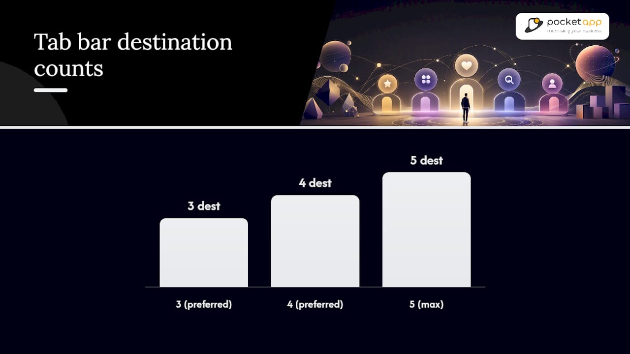
- Tab bar: Primary navigation for 3–5 top-level destinations. Place it at the bottom of the screen within the safe area. iOS 26's Liquid Glass update changes how the tab bar floats and interacts with scrolling content, so test with the latest simulator.
- Navigation bar with large titles: Use for hierarchical content. Large titles collapse on scroll (deference in action). Keep the title short — it will truncate on smaller devices.
- Swipe-back gesture: Never disable it. Users rely on the right-edge swipe to go back; removing it breaks a fundamental affordance.
- Sheets and action sheets: Use sheets for focused tasks that don't require full navigation. Use action sheets for destructive confirmations. Avoid stacking sheets more than two levels deep.
- Context menus: Triggered by long-press, these surface secondary actions without cluttering the primary UI. Ideal for list rows and media items.
Safe-area and gesture rules:
- Always respect safe-area insets. Place interactive controls above the home indicator zone.
- Keep primary call-to-action buttons in the lower-centre or lower-right of the thumb zone, not pinned to the very bottom edge.
- Limit primary destinations in a tab bar to five; three or four is often cleaner.
The table below shows the most relevant differences between iOS and Android conventions that affect design decisions:
| Design dimension | iOS convention | Android convention |
|---|---|---|
| Primary navigation | Bottom tab bar | Bottom nav bar or navigation drawer |
| Back navigation | Swipe-back gesture + nav bar button | System back button or gesture |
| System font | SF Pro / SF Compact | Roboto / Google Sans |
| Minimum touch target | 44×44 pt | 44×44 pt |
| Modal presentation | Sheet slides up from bottom | Full-screen or dialog |
How do touch targets, thumb zones, and accessibility work together?
Accessibility in iOS app design is not a post-launch audit item. It is a layout constraint you apply from the first artboard.
UXPin's 2026 mobile UI guide confirms the minimum touch target for iOS is 44×44 pt. This applies to icon buttons, toggle switches, and any tappable row. A visual element can be smaller, but its hit area must meet this minimum. In Figma, add an invisible 44×44 pt frame around small icons and annotate it for your engineers.
Contrast and Dynamic Type:
- Body text requires a contrast ratio of at least 4.5:1 against its background (WCAG AA).
- Large text (18 pt regular or 14 pt bold and above) requires 3:1.
- Test contrast with Xcode's Accessibility Inspector or the Colour Contrast Analyser tool rather than eyeballing it.
- Support Dynamic Type by using Apple's text styles (Body, Headline, Caption) rather than fixed font sizes. Layouts must reflow gracefully at the largest accessibility sizes.
Accessibility checklist:
- Every icon-only button must have an accessibility label set in code.
- Avoid conveying information through colour alone; pair colour with a label, icon, or pattern.
- Test VoiceOver navigation end-to-end on a real device, not just in the simulator.
- Check that modal sheets and alerts are announced correctly by VoiceOver.
- Use Pocketapp's accessibility design guidance as a reference for compliance sign-off on UK projects.
UK localisation note: Date formats should follow the DD/MM/YYYY convention. Privacy permission prompts must use plain English that reflects the actual data use — vague phrasing fails both users and the UK ICO's expectations around transparency.
| Accessibility requirement | Minimum value | Testing tool |
|---|---|---|
| Body text contrast ratio | 4.5:1 | Xcode Accessibility Inspector |
| Large text contrast ratio | 3:1 | Colour Contrast Analyser |
| Minimum touch target | 44×44 pt | Xcode Accessibility Inspector |
| Dynamic Type support | All Apple text styles | Settings > Accessibility > Larger Text |
How do you design responsive layouts across iPhone, iPad, and large screens?
Designing for one screen size and hoping it scales is how you end up with a broken iPad layout two weeks before launch. Design from a baseline and define adaptive rules from the start.

Device baselines to work from:
Adaptive layout rules:
- Switch from a bottom tab bar to a sidebar (UISplitViewController or NavigationSplitView) when the horizontal size class is regular — typically iPad and large iPhones in landscape.
- Use an 8-point spacing grid throughout. It divides evenly into most device widths and keeps layouts consistent across artboards.
- Always set safe-area insets in your design file. The Dynamic Island on Pro models and the home indicator on all modern iPhones consume real space.
- Test your layout at the smallest supported device size (iPhone SE, 375×667 pt) and the largest (iPad Pro 13-inch) before handoff.
Apple's interface fundamentals documentation covers how windows, scenes, and size classes interact across platforms — worth bookmarking for SwiftUI and UIKit decisions.
Pro tip for Figma users: Use auto-layout with min/max width constraints on containers rather than fixed frames. This lets you resize a single artboard to test breakpoints without duplicating components.
When should you use animation, and how long should it last?
Motion in iOS serves three functions: communicating state change, establishing spatial relationships, and guiding attention. Any animation that does none of these three things is decorative noise.
WWDC25's Liquid Glass guidance introduces new transitional behaviours for bars and toolbars that designers should accommodate rather than override. The new materials respond to scroll position and interaction state, so custom animations that fight these system behaviours will feel jarring.
Practical timing guidelines:
- Standard transitions (push, pop, modal present): 300–400 ms with a spring curve.
- Micro-interactions (button press, toggle): 150–200 ms, ease-in-out.
- Loading state transitions: keep under 500 ms; anything longer needs a progress indicator.
Dos and don'ts:
- Do use motion to explain where a new screen came from (a card expanding into a detail view).
- Do animate state changes (a button shifting from inactive to active) so users understand what happened.
- Don't rely on animation as the only cue for an error or success state; pair it with colour, icon, and text.
- Don't loop animations in the background; they drain battery and distract.
Accessibility: Respect the Reduce Motion setting. When it is enabled, replace sliding transitions with cross-fades and remove parallax effects. Test by enabling Settings > Accessibility > Motion > Reduce Motion on a real device. For deeper guidance on UI animation patterns, the Pocketapp UI animation guide covers timing and easing in more detail.
Pro Tip: Build a motion token alongside your colour and spacing tokens. Define named durations (duration-fast: 150 ms, duration-standard: 300 ms) and reference them in both your Figma prototype and your SwiftUI code. It keeps animation consistent and makes it trivial to honour Reduce Motion by swapping one token value.
Which tools and resources should you use to prototype iOS UIs?
A realistic prototype built with accurate components will surface layout and interaction problems before a single line of production code is written. The tools below cover the full range from quick wireframes to near-native gesture prototypes.
Official Apple resources:
- Apple Design Resources provides official UI kits for Figma and Sketch, SF Symbols, and icon templates. These are the most accurate starting point for platform-correct components.
- SF Symbols is Apple's icon library of over 6,000 symbols that scale with Dynamic Type, support multicolour rendering, and adapt to dark mode automatically. Use them before reaching for a third-party icon set.
Prototyping tools:
- Figma is the standard for collaborative iOS UI design. Use the Apple Design Resources Figma kit for accurate components, auto-layout for adaptive frames, and Figma's prototype mode for tap and swipe interactions.
- Sketch remains widely used in UK studios, particularly for teams with established component libraries. Its Symbols system maps well to iOS component architecture.
- ProtoPie handles complex gesture-based interactions (multi-finger swipes, scroll-linked animations) that Figma's prototype mode cannot replicate. Use it for high-fidelity gesture demos before handing off to engineers.
Inspiration galleries:
- Mobbin is the most useful flow-based reference for iOS patterns. You can filter by app category, screen type, and interaction pattern, which makes it far more efficient than browsing screenshots randomly.
- Dribbble is better for visual direction and component aesthetics than for flow research. Use it for colour, typography, and layout inspiration rather than as a source of interaction patterns.
For teams exploring AI-assisted prototyping, UXPin's 2026 guide notes that AI-generated component prototypes produce more consistent results when design tokens and flow architecture are defined before generation. Define your token set first.
Recommended workflow:
- Map user flows (whiteboard or FigJam).
- Wireframe key screens at low fidelity.
- Build a component library using Apple Design Resources as the base.
- Assemble interactive prototypes in Figma or ProtoPie.
- Hand off to engineers with annotated specs, exported assets, and a token reference.
For open-source prototyping options, this 2026 overview of open-source prototyping tools covers several alternatives worth evaluating alongside commercial tools.
What does a solid testing and handoff process look like?
A design file that engineers cannot interpret confidently is a liability. Handoff is a design deliverable, not an afterthought.
Handoff checklist:
- Export assets at 1×, 2×, and 3× for all image assets; use PDF for vector icons where possible.
- Name every layer and component consistently (BEM-style or a convention agreed with your engineering team).
- Annotate safe-area insets and minimum touch-target sizes on interactive elements.
- Include accessibility labels for every icon-only button in the spec.
- Reference design tokens by name in the spec rather than raw hex values or pixel numbers.
- Add UIKit or SwiftUI notes for non-standard interactions (custom transitions, gesture recognisers).
- Confirm dark-mode variants exist for every colour token and image asset with transparency.
Performance considerations:
- Compress image assets before export. Use WebP or HEIC for photographs; PNG for UI graphics with transparency.
- Avoid embedding large images in cells that will be rendered in a scroll view without lazy loading.
- Flag any animation that runs on the main thread for engineer review; off-main-thread rendering is critical for 60 fps scrolling.
Test scenarios to cover before release:
- Extreme Dynamic Type sizes (the largest accessibility setting will break most fixed-height cells).
- Offline and low-bandwidth states — UXMagic's 2026 guide identifies designing for offline and error states as one of the most common sources of rework.
- Interruptibility: phone call received mid-flow, app backgrounded and resumed.
- TestFlight feedback: release to a small internal group first and capture VoiceOver and Dynamic Type issues before a wider beta.
For a step-by-step UX improvement process that complements this checklist, the Pocketapp UX improvement guide is a practical companion resource.
How Pocketapp applies these rules on UK client projects
Pocketapp's workflow across its portfolio of over 300 projects follows a consistent sequence that maps directly onto the principles above.
Discovery to launch, step by step:
- Discovery workshop: Define user goals, business constraints, and platform requirements. For UK projects, this includes agreeing on localisation scope (date formats, currency, regional language tone) and privacy permission copy.
- Information architecture: Map flows before screens. Every navigation decision is validated against HIG patterns at this stage.
- Token definition: Colour, typography, spacing, and motion tokens are defined before any screen design begins. This single step eliminates the majority of design-to-engineering inconsistencies.
- Prototype and review: Interactive prototypes in Figma are tested with real users and iterated before the build phase starts.
- Handoff: Annotated specs, exported assets at all densities, and a token reference sheet go to engineers. Accessibility labels and safe-area annotations are included as standard.
- Post-launch analytics: Usage data informs the next iteration cycle.
Clients including WWF, Dechra, and Crocus have benefited from this process. The Pocketapp iOS design service page shows current portfolio examples and the range of sectors covered.
UK project checklist:
- Date formats: DD/MM/YYYY throughout.
- Currency: £ symbol, no space before the amount.
- Privacy prompts: plain English, specific about data use, aligned with ICO guidance.
- Accessibility sign-off: contrast ratios checked, VoiceOver tested on device, Dynamic Type verified at maximum size.
Pro Tip: Define your token set in a shared Figma library that your engineers can reference directly. When a colour or spacing value changes, it updates everywhere. On a project with multiple screens and two platforms, this saves days of rework and prevents the "which shade of blue is correct?" conversation at handoff.
A practitioner's perspective on iOS design trade-offs
The most persistent tension in iOS app design is between brand expression and platform familiarity. Clients often arrive wanting something that looks unlike any other app. Engineers often push back in favour of system components. Both instincts are partially right.
System components earn their place because they carry years of user trust. A custom tab bar that behaves slightly differently from the system one will confuse users in ways they cannot articulate but will feel. That friction shows up in retention data, not in design reviews.
At the same time, brand identity matters. The answer is not to choose one over the other but to be precise about where each belongs. Navigation chrome should feel like iOS. Content, typography, illustration, and colour should feel like the brand. This is exactly what WWDC26's brand identity guidance formalizes.
On projects at Pocketapp, the choices that most reliably reduce engineering rework are token-first design and flow-first architecture. When a designer hands off a file where every value references a named token, engineers spend their time building rather than interpreting. When flows are validated before screens are designed, the navigation structure rarely needs to be rebuilt mid-sprint.
One thing that gets underestimated: designing for error and offline states. Most design time goes to the happy path. But users encounter empty states, network failures, and permission denials constantly. Apps that handle these gracefully retain users; apps that show a blank screen or a cryptic error do not. Build these screens into your component library from the start, not as a final-week addition.
Pocketapp's iOS design and development services
Pocketapp offers end-to-end iOS app design and development for UK businesses, from the initial discovery workshop through to post-launch analytics and feature updates. The team covers UX/UI design, interactive prototyping, agile build cycles, and cross-platform delivery, so you get a single partner from concept to live product.
Whether you need a greenfield iOS app, a design audit of an existing product, or a full mobile application design engagement, Pocketapp's process is built around the HIG-aligned workflow described in this article. With over 300 completed projects across retail, healthcare, charity, and B2B sectors, the team brings direct experience of the patterns and trade-offs that matter on real UK products. To discuss your project, visit the iOS app designers page or get in touch to arrange a free discovery call.
Sources
- Designing for iOS | Apple Developer Documentation
- What Is Mobile UI? Principles, Patterns, and Best Practices for Mobile App Design (2026) | UXPin
- Uxmagic
FAQ
What is the minimum touch target size for iOS?
Apple specifies a minimum of 44×44 pt for all interactive elements. The visual element can be smaller, but the tappable hit area must meet this size.
What are the three core iOS design principles?
Apple's Human Interface Guidelines define clarity, deference, and depth as the three principles that should guide every iOS interface decision.
How do you support dark mode in an iOS app?
Use semantic colour tokens (system colours like .label, .background, or custom adaptive colours defined in your asset catalogue) rather than fixed hex values. Every image asset with transparency also needs a dark-mode variant.
What is Liquid Glass in iOS 26?
Liquid Glass is Apple's updated design language introduced in iOS 26, where bars, tab views, and toolbars use a new translucent material that floats above content. Designers should adopt system views to accommodate the new behaviours rather than building custom chrome.
How does Pocketapp approach iOS app design for UK clients?
Pocketapp runs a discovery workshop to define flows, tokens, and localisation requirements before any screen design begins, then delivers annotated Figma specs and accessibility-tested prototypes as part of a standard handoff for every project.